#184. The objective economy, part one

IN PURSUIT OF THE EVIDENCE

The title of this article has two meanings. First, it signifies that the economy is a physical entity – indeed, is an energy system – rather than an immaterial construct based on the human artefact of money.

Second, it underlines an imperative need to examine evidence objectively. This is particularly important at a time when both of the contentions that vie for our acceptance – ‘continuity’ and ‘collapse’ – are so very far from persuasive. The aim here is to apply the principles of the energy economy, and the SEEDS economic model, to examine the real economic situation, free from assumption, denial and wishful-thinking.

Enormous changes do indeed lie ahead, and were underway well before the coronavirus pandemic struck a body-blow at the economy. The narrative of continuity – of indefinite economic growth, and of the perpetual preservation of current assumptions, systems and power structures – has been holed below the waterline.

But it does not follow, from this, that economic and social collapse has become inevitable. Big changes can happen without amounting to ‘collapse’. After all, history is peppered with dramatic, supposedly ‘World-ending’ events – including financial crashes, revolutions and the ousting of entire established elites – which did not, in reality, amount to ‘collapse’.

Our imperatives now fall into two categories. First, we need to understand how the economy really works, abandoning notions that purely financial expedients can overcome physical realities, and basing our interpretations on the evidence.

Second, we need to anticipate, and to be prepared for, the challenges posed by the invalidation of the established (though unfounded) notion of ‘economic growth in perpetuity’.

Additionally, we need to accept that the changes which lie ahead dwarf party politics into comparative irrelevance. To this end, the aim here is to leave discussion of politics and politicians to others, concentrating instead on economic and related fundamentals. Much as war-gamers enjoy re-fighting Waterloo or Jutland, there are places for debating the minutiae and meaning of elections – but these are not our priorities here. 

Introduction

In part one of Gulliver’s Travels, Jonathan Swift uses the neighbouring islands of Lilliput and Blefuscu to satirize the Europe of the early eighteenth century. The English political rivalry between Whigs and Tories is represented by people who favour shoes with low or high heels, whilst arguments about the right way to crack an egg (at the large end or the small?) correspond to the distinction between Catholicism and Protestantism. Matters of supposedly huge contemporary political and religious importance are thus reduced to trivialities at which readers are invited to laugh.

They have been doing so ever since 1726.

If a latter-day Swift was writing now, he could do worse than satirize the debate over ‘continuity’ or ‘collapse’ in much the same way. Continuity, of course, is the line taken by governments, business and much of the mainstream media. Collapse, though a fringe persuasion, is a remarkably widespread one. Even commentators who do not avowedly endorse the thesis of collapse often produce interpretations which point emphatically in that direction.

In a time of such polarized expectation, it’s as well to remember that continuity and collapse are not the only possibilities on the table. Whilst the continuity thesis owes a great deal to wishful thinking and denial, prophecies of collapse overlook the fact that, historically, such events have been extremely rare. Stock market crashes, national defaults, changes of governments and even the ousting of incumbent elites in their entirety have occurred pretty frequently, and haven’t resulted in economic or social collapse.

In short, the evidence either for continuity or for collapse is scant. Something new is happening, but we can only anticipate what that is likely to be by weighing the evidence. Doing so produces conclusions which, though they might be startling, are a long way short of collapse.

Taking ‘perpetual growth’ off the table will itself create profound changes. We can anticipate sharp downwards adjustments in asset prices, the fall from grace of many activities now regarded as gold-plated, and the overturning of many political arrangements and assumptions. But none of this, necessarily, amounts to collapse.

The economy – an energy system

To get anywhere at all with our investigation, we need to start by recognizing that the economy is an energy system, and not a financial one. Money is a human artefact used to exchange the goods and services that constitute economic output, but all of these are products of energy. Our economic history is a narrative of how we have applied energy to improve our material conditions.

This is illustrated by the way in which energy consumption, on the one hand, and, on the other, population numbers and their economic means of support, have related to each other over the centuries (fig. 1). It is no coincidence at all that population numbers took off exponentially when, from the 1760s, the discovery of the first efficient heat-engine enabled us to harness vast amounts of fossil fuel energy, starting with coal before moving on to oil and natural gas.

Just as importantly, the use of energy has grown even faster than population numbers throughout the Industrial Age. Expressed as tonnes of energy consumed per person, this ratio has moved steadily upwards, rising particularly quickly in the half-century before 1914, and in the years after 1945. This ratio flat-lined (but did not decrease) during the oil crises of the 1970s, and resumed its upwards trajectory in a period that correlates with the rise of China and other EM (emerging market) economies.

Fig. 1

Today, and pending further evidence to be considered here, we can postulate a decline in the quantity of energy consumed per person. Whilst prior trends of the growth in the use of oil, gas and coal are ceasing to look sustainable, it is by no means clear that renewable energy (RE) sources can grow rapidly enough to take up the baton from fossil fuels (FFs).

There’s a compelling case for believing that the aggregate supply of primary energy may not grow as rapidly in the future as it has in the past. Population numbers, meanwhile, are continuing to increase, albeit at decelerating rates.

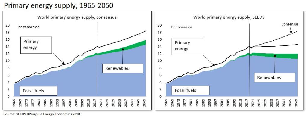
The peaking of energy supply per capita is not recognized by believers in perpetual growth. Consensus supply expectations – as of late 2019, but probably not too different now – see us using about 20% more primary energy in 2040 than we did in 2018. Of course, RE supplies are projected to increase particularly rapidly, expanding by about 80%. But, because RE supply starts from a low base, this big percentage increment would still account for only about 16% of the assumed net increase in total energy supply.

If we are indeed to increase annual supply by about 2.8 bn tonnes of oil equivalent (toe) between 2018 (13.9 bn toe) and 2040 (16.6 bn toe), we are still going to need a projected 16% more fossil fuels, including an increase of between 10% and 12% in the supply of oil.

There are various reasons for supposing that this consensus view might be mistaken, but the main one is that the costs of fossil fuel supply are rising, an issue to which we shall return. The widely-canvassed view that REs can supplant FFs – such that the need for oil, gas and coal decreases rapidly – is very largely a product of wishful thinking. Independent estimates have put the cost of energy transition at between $95 trillion and $110tn, and even if such sums were affordable, numerous technical issues remain, amongst them the material resources required for such a programme.

This is put into context in fig. 2, from which you can see quite how much more RE (shown in green) would be required if we were to replace all or even most of our continued reliance on FFs (blue).

Fig. 2

As fig. 2 also shows, the SEEDS model has ceased using consensus projections for forward energy supply, employing instead a more cautious analysis in which declines in the availability of fossil fuels are, at best, matched by increases in supply from REs, nuclear power and hydroelectricity.

The resulting projection is that primary energy supply changes very little between now and 2040. SEEDS does not postulate a material decline in aggregate supplies of primary energy, but does suggest that energy use per capita may now be on a downwards trajectory.        

ECoE – of cost and quantity

The calculation of economic value at any particular time isn’t, unfortunately, a simple matter of dividing the quantity of energy supply by the number of people using it.

For one thing, the various sources of primary energy are unequal, in terms of the economic utility that they provide. A ton of feathers might, by definition, weigh the same as a ton of lead, but their characteristics are otherwise very different. Likewise, an oil-equivalent tonne of petroleum and an oe tonne of solar or wind power have quite different economic characteristics.    

For another, the supply of energy for economic use is never ‘free’ of cost. Rather, whenever energy is accessed for our use, some of that energy is always consumed in the access process. We need wells and refineries to put petroleum to use, pipelines and processing plants to access natural gas, mines and power-stations to make use of coal, and solar panels and wind turbines to channel the energy provided by the sun and the winds. Creating these facilities – and, just as important, maintaining them, and replacing them as they wear out – uses energy.

This equation divides any given stream of energy supply into two components. One of these, the ‘consumed in access’ part, is known here as the Energy Cost of Energy, or ECoE. What remains, and is available for all other economic purposes, is surplus energy.

Clearly, and within any given quantity of energy, the higher the ECoE, the lower the surplus. An ECoE of 1% leaves 99% of accessed energy available for us to use. If ECoE rises to 10%, however, the surplus shrinks to 90%.

Properly considered, the cost of energy supply isn’t measured by the number of dollars needed to bring energy to the consumer. What matters is the energetic equation between the ECoE cost, and the residual (surplus) utility, of energy that we access.

This has a direct bearing on the quantity of energy that can be supplied, which is why the rise in trend ECoEs is reflected in SEEDS projections that the aggregate supply of energy to the economy is unlikely to rise as rapidly in our higher-ECoE future than it did in our lower-ECoE past.

This is illustrated in fig. 3, which compares ECoE trends with projected supplies of primary energy in aggregate, and fossil fuels in particular. As overall ECoEs rise, growth in aggregate energy supply can be expected to taper off – and, as the ECoEs of fossil fuels rise particularly rapidly, available quantities are likely to decrease

Fig. 3

What emerges here is an equation in which the level of ECoE influences economic output in two ways, not one. First, ECoEs affect the economics of energy supply itself, influencing how much energy is available. Second, ECoEs determine, within that available quantity of energy, how much is absorbed in access cost, and how much remains for those economic purposes which constitute prosperity.

It should not concern us unduly that established interpretations of economics, and the methods used to forecast future energy availability, take no notice of ECoE. After all, spherical trigonometry, vital to navigators over the centuries, could not be understood or applied until Flat Earth interpretations had been confined to the history-books.

Where energy supply forecasting is concerned, the approach appears to be to take assumed levels of economic activity in the future and only then to calculate the energy required by an economy of that assumed future size. This, of course, is to put things in the wrong order – energy supply determines economic output, not the other way around.

ECoE trends – the relentless squeeze

These considerations make it imperative that we understand the ways in which ECoEs evolve.

In essence, four factors determine the evolution of ECoEs. Two of these act to reduce ECoEs; one pushes them upwards; and the fourth operates in ways which are, in general, misunderstood.

ECoEs are driven downwards by geographic reach and economies of scale. Until comparatively recently, the fossil fuel industries pursued the search for new, low-cost resources in locations which had not previously been explored, and which, in some cases, had been politically inaccessible. Economies of scale operate where increasing the size of operations enables the numerator of fixed costs to be spread over a larger denominator of units of output.

With both ‘reach’ and ‘scale’ exhausted, the driving factor now is depletion, which describes the way in which, quite naturally, lowest-cost energy sources are exploited first, leaving costlier alternatives for a ‘later’ which has now arrived.    

The potentialities of the fourth determinant, technology, are often overstated, because technological progress cannot change the physical characteristics of the resource.

Fracking, for instance, has reduced the cost of accessing shale hydrocarbons in comparison with the cost of accessing that same resource at an earlier time. What technology has not done is to put the economics of shales onto the same footing as giant, technically-straightforward fields in the sands of Arabia. This is rendered impossible by the starkly differing physical qualities of the two resources.

These principles can be presented diagrammatically as in fig. 4. The evolution of ECoEs follows a parabolic course, turning upwards as the downwards pressures of reach and scale are exhausted, and depletion takes over. Technology operates to accelerate the downwards trend in the early progress of ECoEs, and then to mitigate the upwards tendencies of depletion.

The right-hand, up-trending side of the parabola conforms to the observable exponential rate of increase in ECoEs since they reached their nadir in the immediate decades after 1945.     

Fig. 4

Measured in money

Thus far we have followed an interpretation of the economy which, though it lacks many of the complications of ‘conventional’ schools of thought, is surely far more persuasive. Describing the economy in solid, material terms – rather than in abstract, financial ones – accords with what we know about the importance of physical goods and services. Tying the economy to the demonstrable laws of thermodynamics makes far more sense than trying to link it to the behavioural observations of the artefact of money which conventional economics is pleased to call ‘laws’.

Thus presented, the economic history of the Industrial Age starts with the invention of the first heat-engine and the unlocking of the energy contained in fossil fuels. We have seen how – over time, and aided by technology – geographic reach and economies of scale have pushed ECoEs downwards, driving up material (meaning energy) economic output, and thereby enabling exponential increases in population numbers.

Latterly, as depletion has taken over from reach and scale, fossil fuel ECoEs have risen relentlessly, pushing us ever further into financial gimmickry in a futile effort to portray a continuation of ‘business [meaning growth] as usual’.   

When dealing with the World as it is, though, any case presented in thermodynamic terms must remain at the margins, excluded from debates which are conducted almost entirely in the idiom and nomenclature of money. To play any part in this debate, our conclusions need to be translated into financial language, and this is what the SEEDS model is designed to accomplish. 

We need to be clear from the outset that money has no intrinsic worth, commanding value only as a ‘claim’ on the physical output of the energy economy. Obviously, parachuting food or water to a person adrift in a lifeboat or lost in a desert would help them, but an air-drop of money would not alleviate their plight in the slightest degree. Money, as a medium of exchange, has no utility unless there are things for which it can be exchanged.

What is ‘output’?

The conventional measure of economic activity is GDP (gross domestic product), but one of the many problems with this metric is that it measures flow (the equivalent of a company’s income statement) in a way that is largely de-linked from stock (which corresponds to the balance sheet). You could not, in practice, manage a business by concentrating entirely on income, and treating the balance sheet as of little or no account.

This distorted interpretation means that, within certain prescribed (but very wide) limits, GDP can be pretty much ‘whatever you want it to be’, at least to the extent that you can push net new credit into the system.

The injection of credit has the effect, of course, of inflating asset prices, but such movements are excluded from definitions of inflation, which concentrate entirely on consumer (retail) prices. If the prices of food, cars, computers and other consumer purchases soar, we say that inflation has surged, but the same is not said of escalation in the prices of equities and property.

We can see some of these distorting effects in action if we compare, as examples, the United States and China over the past twenty years (fig. 5).

Between 1999 and 2019, Chinese GDP increased at an average annual rate of 8.3%, far higher than the 2.1% averaged in America. What is left out of this equation, though, is that annual borrowing averaged 23.7% of GDP in China, compared with 7.8% in America. The point here isn’t the absolute scale (or wisdom) of the borrowing undertaken in either country, but the direct relationship between borrowing and reported growth.

Fig. 5

The same analysis applied to the World economy – and calibrated in constant international dollars – is set out in fig. 6. Between 1999 and 2019, reported growth of $64.5 trillion (or 95%) in GDP was far exceeded by a $193tn (177%) increase in debt.

One way to look at this is that, during two decades in which reported GDP “growth” averaged 3.3%, annual borrowing averaged 9.9% of GDP. This, very obviously, is not a sustainable relationship. Another way to look at it is that each reported “growth” dollar was accompanied by $3 of net new debt, to which, for a fully rounded interpretation, might be added truly enormous increases in pension and other unfunded commitments.

We might choose to believe that debt – since we can default on it, or inflate it out of existence – ‘doesn’t matter all that much’. We might even extend such a rationale to pension promises, though that would be a hard sell to people whose pensions don’t turn up, or have been devalued enormously by inflation.

This dismissal of debt certainly seems to have been the policy logic during the decade before 2008, though the outcome of that state of mind can hardly be regarded as a positive one. The view taken here is that debt and pension commitments do matter, very much indeed, not least because one person’s liability is another person’s asset.

This debate over the meaningfulness of debt as a capital liability, though, misses the immediate point, which is that reported “growth” – and recorded GDP itself – are inflated artificially by the injection of credit.

If, for instance, annual net borrowing was to fall to zero, growth, too, would slump, to barely 1%. Likewise, if we actually paid down debt to its level at an earlier date, much of the intervening “growth” since that date would go into reverse, and recorded GDP would shrink.   

For our purposes, this ‘credit effect’ needs to be stripped out if we’re to arrive at a financial calibration that can be used in a meaningful appraisal of economic performance. The SEEDS model calculates that underlying or ‘clean’ output, known here as ‘C-GDP’, grew by an annual average rate of only 1.6% (rather than 3.3%) between 1999 and 2019. Furthermore, it reveals that even this lower rate of underlying growth has been fading, at the same time as ever more credit injection has been used to buttress reported “growth”.    

Fig. 6

There are three points to be noted from fig. 6. First, reported GDP has long been far exceeded by increments to debt. Second, exclusion of this credit effect reveals far lower levels of trend growth.

Third, these divergences have had compounding effects. The insertion of a wedge (shown in pink) between aggregate debt and recorded GDP has introduced a corresponding divergence between the reported (GDP) and the underlying (C-GDP) levels of economic output.

ECoE and prosperity

What emerges, then – from behind the smoke-and-mirrors of credit and monetary adventurism – is a deceleration in economic growth which accords with a deterioration in the energy equation that has driven the economy since the start of the Industrial Age, and was at its most dynamic in the decades immediately after the Second World War.

Deceleration has been particularly marked since the second half of the 1990s, when confidence in the “great moderation” turned pretty rapidly to concern about the onset of (seemingly inexplicable) “secular stagnation”.

This is where we need to bring in ECoE to complete the prosperity picture. By stripping out the ‘credit effect’ to identify underlying C-GDP, we have calibrated what might be thought of as ‘gross’ economic output, but, as we’ve seen, not all of the value obtained from the use of energy is ‘free and clear’ – some of it (ECoE) is consumed in the process of accessing energy, reducing what remains for all other economic purposes.

To express prosperity in financial terms, then, the required equation can be defined as C-GDP minus ECoE. This gives us an aggregate prosperity number that can then be divided by the population total to tell us the prosperity per capita of the average individual at any particular time.

When this calculation is undertaken on a consistent basis across the 30 national economies covered by the SEEDS model, a striking trend emerges.

In almost all Western advanced economies, prosperity per capita peaked and then turned down between 1997 (Japan) and 2007 (Canada and Greece). But, until quite recently, prosperity per person has continued to improve in the emerging market (EM) countries covered by the system.

This is not, of course, remotely coincidental.

In fig. 7, we compare prosperity per capita with national trend ECoE for America, China and the World as a whole. Where prosperity per person reaches its zenith (as referenced on the left-hand axis of each chart), a vertical line is taken down to ECoE at that time, and is read across to the scale on the right.

Thus, American prosperity reached its high-point back in 2000, when ECoE was 4.5%, whilst Chinese prosperity was still rising in 2019, at an ECoE of 8.2%. In the latter case, prosperity might, in the absence of the pandemic, have continued to improve, but not for much longer. Prior to the coronavirus crisis, SEEDS was indicating that Chinese prosperity was going to turn downwards during the period 2020-22.  

What emerges from SEEDS analysis is that Western and EM economies have different ECoE climacterics at which prosperity per capita ceases to grow and turns downwards. In the Advanced Economies, this climacteric occurs at ECoEs of between 3.5% and 5.0%. By virtue of their lesser complexity, which in turn means that energy maintenance costs are lower, EM countries can continue to expand prosperity per capita until ECoEs are between 8% and 10%.

This, incidentally, explains why EM economies have so often been described as being more ‘dynamic’ than Western countries. Many theories have been advanced in an effort to ‘explain’ the supposedly greater dynamism of, say, China or India in comparison with America and Europe.

The reality, though, is much simpler. It is that EM nations had yet to reach an ECoE threshold which, for them, was structurally higher than the one which had already put prosperity expansion in the West into reverse.

For many years now, global prosperity has reflected deterioration in the West, offset by continuing progress in the EM countries. As a result, World prosperity per capita has been on a long plateau – expressed in constant dollars converted on the PPP (purchasing power parity) convention, the average has seldom varied much from $11,000 per person since the early 2000s. This is why, in the right-hand chart in fig. 7, the climacteric in global prosperity, and the associated levels of ECoE, are shown as ranges rather than as a specific point.    

Now, though, it has become apparent that the long plateau has ended, such that the prosperity of the World’s average person has gone into decline. Even before the coronavirus crisis, it had looked likely that 2018-19 was going to be the turning-point in global prosperity. 

Fig. 7

The view from where we are

The aim in this analysis has been to move step by step along a logical path to reach conclusions which, whilst they invalidate the promise of ‘continuity of perpetual growth’, fall well short of endorsing prophecies of inevitable economic and social collapse.

We have seen how, as an energy system, the economy has grown rapidly on the basis of rising quantities of energy supply and – until relatively recently – falling ECoEs. Latterly, the rise in ECoEs has undermined the capability for further expansion, turning complex Western economies ex-growth before moving on to impose the same effects on lower-maintenance, less ECoE-sensitive EM countries.

Two expedients have been used, if not to halt this process, then at least to disguise it. First, we’ve been using ever-larger quantities of energy at the gross level to counteract a deterioration in the prosperity yielded by each unit of energy consumed.

Second, we’ve resorted to increasingly extreme exercises in financial gimmickry on the false premise that making money both cheaper and more abundant can somehow ‘fix’ trends that conventional, money-based interpretation cannot explain. Along the way, we’ve managed to persuade ourselves that policies such as ZIRP, NIRP and QE are somehow ‘normal’ and ‘sustainable’, when the obvious reality is that they are neither.

Looking ahead, we can anticipate that both of these expedients will fail.

It seems increasingly unlikely that we can carry on growing supplies of primary energy at rates that have been accomplished in the past, and are assumed to be possible in the future. The switch to renewable energy sources, imperative though it is on environmental and economic grounds, might not enable us to replace lost quantities of fossil fuels, and cannot be expected to push ECoEs back downwards to levels at which prior levels prosperity can be sustained.

At the same time, financial adventurism has rendered the financial economy very largely dysfunctional, introducing ever greater risk into the system.

Financial dislocation, which might well include slumps in asset prices, and/or the deliberate introduction of high inflation, has now moved from the ‘probable’ to the ‘virtually inescapable’. As hardship worsens, popular priorities can be expected to change, whilst political, commercial and financial models based on the false predicate of perpetual growth will come under increasing strains.

To be sure, the economy is an extensively interconnected system, and compounding effects – to be discussed in a subsequent instalment – are capable of accelerating the pace at which prosperity erodes. Indeed, the latest version of the SEEDS model now incorporates a facility for including these compounding effects into analysis and projection.

From where we are, though, we cannot assume that the outcome must be collapse. For those caught on the wrong side of fundamental changes in the past, it must have seemed that, for them, the World had ‘come to an end’. Examples from history are abundant, and include craft workers overtaken by the “dark satanic mills”, French and Russian aristocrats and functionaries swept aside by revolution, and investors destroyed by the Wall Street Crash.

Objectively, none of these events amounted to collapse. Each, moreover, included winners as well as losers, and gains, as well as losses, for the quality of life.

In the next instalment, we’ll start an analysis of how these ‘profound-but-short-of-collapse’ changes are likely to play out.

#181. The castaway’s dilemma, part one

MAPPING THE REAL ECONOMY

Of what value are facts?

If this question arises with unparalleled force now, it’s because of the enormous, perhaps unprecedented divergence between the economy (and many other issues) as they are perceived and presented to us, and these same things as they actually are.

Starting with perception, the generally accepted narrative is that the Wuhan coronavirus pandemic is something which struck ‘out of a blue sky’, and could not have been anticipated. In due course, we’re assured, the economy will stage a ‘full recovery’, returning to pretty much its previous size, shape and direction, with monetary policy assisting this ‘return to normal’. Even the lasting damage inflicted on the economy can be made good over time. Life must go on, especially in politics, whilst most of the West’s incumbent regimes are making a pretty good fist of handling the pandemic-induced crisis.

This ‘consensus’ line on our current predicament is wrong, in almost every particular. Far from being unpredictable, the pandemic was anticipated by leading scientists whose prescient advice is, for the most part, still being ignored. Any economic ‘recovery’ from here will be largely cosmetic, the shape of the economy is going to be very different indeed, and monetary gimmickry can no more rehabilitate economic prosperity than central banks can ‘print antibodies’. Conventional, ‘business as usual’ party politics matter very little in this situation, and incumbent governments are, in general, making an unholy mess of the coronavirus crisis. When you look at what’s unfolding in, for example, Britain and America, you very literally ‘couldn’t make it up’.

A bad time for reality?

This situation – in which perception and presentation are at a premium, and factual analysis at a hefty discount – is not propitious for the subject-matter of this discussion, which outlines new developments which enable the SEEDS model to map the economy and some of its broader ramifications, the latter including the environmental harm caused by economic activity.

Part of the problem, of course, is an established insistence on the fallacy that the economy is a wholly monetary system, from which it follows that energy is ‘just another input’, and that “[t]he world can, in effect, get by without natural resources”.

Had Daniel Defoe’s Robinson Crusoe, shipwrecked on his desert island, only known about classical economics, he wouldn’t have wasted his efforts finding water, food, firewood and shelter, but would instead have spent his time accumulating bits of coloured paper. Indeed, had computers existed in 1719, he wouldn’t even have needed the paper.

In challenging this absurdity, those of us who understand that the economy is an energy system, and not a financial one, can sometimes feel as isolated as Robinson Crusoe himself. Some comfort can be drawn, though, from the reflection that reality usually wins out in the end, and that pre-knowledge of the outcome has considerable value.  

The energy economy

The energy interpretation of the economy is simply stated, and need only be reiterated in brief here for the information of anyone new to the logic of Surplus Energy Economics.

First, all of the goods and services which constitute the economy are products of the application of energy. Nothing of any economic value (utility) whatsoever can be supplied without it. An economy cut off from the supply of energy would collapse within days. (If they were denied energy, conventional economists would lose the ability to publish learned papers telling us how unimportant energy really is).

Second, whenever energy is accessed for our use, some of that energy is always consumed in the access process, meaning that it’s unavailable for any other economic purpose. This ‘consumed in access’ component is known here as the Energy Cost of Energy, or ECoE, and its roles include defining the difference between output and prosperity.

Third, money has no intrinsic worth, and commands value only as a ‘claim’ on the output of the energy economy. Creating monetary claims that exceed the delivery capability of the economy itself must, therefore, result in the destruction of the supposed ‘value’ represented by those excess claims.

To be clear about this, money is a valid subject of study, so long as we never allow ourselves to be persuaded that to understand the human artefact of money is to understand the economy. Likewise, studying the lore and laws of cricket may be rewarding, but it won’t help you to understand a game of baseball.   

The importance of this very different way of understanding the economy is that it points to conclusions drastically at variance from the comforting narrative generally presented to us.

Well before the coronavirus pandemic, it was evident that prior growth in global average prosperity per person had gone into reverse, and that we were encountering limits to the ability to use financial manipulation to disguise economic deterioration in the advanced economies of the West. The narrative of an ‘economy of more’ – more “growth”, more vehicles on the world’s roads, more flights, more consumption, more profitability and more use of energy – was already well on the way to being discredited. The pandemic crisis merely accelerates trends that had been evident for quite some time.

Critically, this process invalidates a raft of assumptions and of expectations founded entirely on the false presumption of ‘growth in perpetuity’.    

Mapping the real economy

From the outset, the aims of the SEEDS model were (a) to interpret the economy from an energy perspective, and (b) to present this interpretation in the financial language in which debate is customarily conducted.

Development of SEEDS has reached the point where the reality of the energy-driven economy can be mapped. This can best be understood if it is stated as an ability to answer a string of critically-important questions, of which the following are examples.

First, how much economic value do we extract from each unit of primary energy that we consume, and where is this conversion efficiency relationship heading?

Second, from the value thus generated from the use of energy, how much ECoE must be deducted, now and in the future, to define the amount available for all other economic purposes?

Third, what can trends in ECoE tell us about the quantity and mix of energy likely to be available to us in the future? 

Fourth, how, using this knowledge, can we best maximise prosperity whilst minimizing the environmental harm caused by our use of energy?   

This list helps identify a short series of questions of which most can now be addressed as equations. These equations, together with a number of supplementary measurements, can be used mathematically to map the ‘real’ economy of energy and the environment in a way that can be pictured representationally as follows.

The equations

The following summary, though it doesn’t go too far into dry theory, is intended to provide an overview of the SEEDS mapping process.

Equation #1: measuring output

To calibrate the efficiency with which we turn energy use into economic value, we need to start by identifying a meaningful measure of economic output.

GDP cannot serve this purpose because it is subject to extreme monetary distortion. Essentially, reported “growth” is exaggerated by the use of credit and monetary activities which inflate apparent activity. The funding of anticipatory activity, and the inflation of the supposed value of asset-related transactions, are two of the ways in which this happens.

Reflecting this, reported average GDP “growth” of 3.6% between 1999 and 2019 was a direct function of net borrowing which averaged 9.8% of GDP over the same period.

Examination of the processes involved enables the calibration of this distortion, thereby identifying rates of growth in underlying or ‘clean’ output (C-GDP), which are far lower than their reported equivalents. The right-hand chart in fig. 1 illustrates how the insertion of a ‘wedge’ between debt and GDP has inserted a corresponding distortion between reported and underlying economic output.   

Fig. 1: economic output

Equation #2: calibrating economic efficiency

Measured on the basis of C-GDP, economic output per tonne of oil equivalent (toe) of energy consumed has declined steadily, from $7,400 in 1999 to $6,730 last year, reflecting the observation that C-GDP has increased by only 40% over a period in which primary energy consumption expanded by 54%.

This deterioration in conversion efficiency may seem counter-intuitive, but has several important inferences, in addition to the obvious statement that we are using energy less, rather than more, effectively over time.

Specifically, changes in the ‘mix’ of the energy slate seem to be trending towards lesser conversion efficiency, whilst technology has concentrated much more on finding additional applications for energy than on the more efficient use of energy itself.  

Fig. 2: economic efficiency

Equations #3 & 4: ECoE and volume

Trend ECoEs have been rising since a nadir that was enjoyed in the two decades or so after 1945, a period that also – although this was no coincidence at all – witnessed remarkably robust growth in world prosperity.

Latterly, though, a relentless rise in the ECoEs of fossil fuels has driven the overall trend sharply upwards. Optimists believe that the steady fall in the ECoEs of renewable sources of energy (REs) will solve this problem, but this expectation owes far more to hope and extrapolation than it does to realistic interpretation.

Though ECoEs play a critical role in the conversion of economic output into prosperity, they are relevant, too, for the quantities of energy likely to be available to the economy in the future. Hitherto, the consensus expectation has been that energy supply – including the amounts provided by fossil fuels – will continue the steady growth experienced in the past. In comparison with recent levels, this consensus sees us using 10-12% more oil, 30-32% more gas and about the same amount of coal in 2040, with total primary energy supply rising by about 20%.

The reality, though, is that a combination of two factors, both of them related to rising ECoEs, is starting to exert adverse effects on the volume outlook. First, rising costs are increasing the prices required by producers. Second, the upwards trend in ECoEs is, by undermining prosperity, reducing the amounts that consumers can afford to pay for energy.

Accordingly, SEEDS has now adopted a much more cautious scenario which projects little or no growth in aggregate energy supply, combined with a steady decrease in the availability of fossil fuels.      

You’ll appreciate at this point that, if energy volumes cease growing, and if conversion efficiency fails to recover, then real annual economic value output can only trend downwards.

Fig. 3: ECoE and energy supply

Equation #5: measuring prosperity

Properly understood, the economic output value that we derive from energy is not the same thing as prosperity, because the first call on this output is the cost component – ECoE – required for the provision of energy itself.

ECoE defines a proportion of output which, being required for energy supply, is not available for any other economic purpose. Accordingly, the deduction of ECoE from output determines prosperity, whether this is expressed as an aggregate or as a per capita amount.

At the aggregate level, rising ECoEs have inserted a widening wedge between underlying output (C-GDP) and prosperity. Since the rate of annual progression in aggregate prosperity has now fallen below the rate at which population numbers continue to increase, world prosperity per capita has now turned downwards from a lengthy plateau, with the coronavirus crisis seemingly accelerating the pace of deterioration.

Regionally, prosperity per capita in almost all Western advanced economies has already been trending downwards over an extended period, which helps explain why so many of these economies have long seemed moribund despite the increasing use of financial manipulation to present a semblance of continuing “growth”.

This might even make us feel some sympathy for politicians who feel obliged to offer voters “growth” when, on the only criterion that really matters – prosperity – growth has ceased to be feasible.

In the EM (emerging market) countries, prosperity growth was already, pre-pandemic, decelerating markedly towards an inflection point anticipated by SEEDS to occur between 2020 and 2022. This climacteric may have been brought forward by the coronavirus crisis.  

Fig. 4: ECoE and prosperity

Equation #6: economics and the environment

Though global temperature changes (and their causation) remain to a certain extent controversial, broader consideration, taking into account issues such as ecological loss and air quality, make it clear that human activity is harming the environment. By ‘activity’, of course, is meant the use of energy, and it’s surely obvious that we can only co-relate economic and environmental considerations if we place energy use in its proper place as the factor common to both.

Artificially-inflated measurement, such as recorded GDP, not only exaggerates apparent prosperity, but also supplies false comfort over environmental trends. As shown by a comparison of the period between 1999 and 2019 on a global basis, the false metric of GDP can be, and often is, used to assert that we are increasing the quantities of economic value achieved for each tonne of climate-harming CO² emitted into the atmosphere. Rebased to a C-GDP basis, however, it becomes apparent that CO² emissions have expanded by 48% whilst underlying economic output has increased by only 40%.

Moreover, rising ECoEs are worsening the relationship between prosperity and environmental harm. Critically, CO² emissions are related to gross amounts of energy used (including ECoE), whereas net amounts (excluding ECoE) determine prosperity.         

 Fig. 5: The environmental dimension

Equation #7: deviation from the real

The final mapping equation – in fact, a set of equations – cross-references the economy as it is to the version of the situation as it is presented to us.

Essentially, two components intervene between underlying prosperity and the version presented to the public as GDP. The first of these is ECoE, which conventional econometrics ignores. The second is the credit effect which arises where monetary policies are used to promote anticipatory activity, and to inflate the apparent value of asset-related transactions (as well as inflating asset values themselves).

SEEDS analysis enables us to quantify these distortions, and this, amongst other things, helps us to identify the adverse leverage in the mechanisms by which faltering prosperity is represented as expanding output.

From a purist perspective, this is something that we might ignore, concentrating our efforts on the identification of the ‘fact’ of prosperity.

In practical terms, however, this disparity is of the greatest importance, because it identifies the widening gap between semblance and substance.  

For anyone engaged in economic planning – whether in government, in business or in finance and investment – it can be argued that this is the most important equation of them all.

Fig. 6: reality and presentation

#180. In search of competitive edge

LOGIC, ‘CONTINUITY BIAS’ AND THE BALANCE OF IMPROBABILITIES

Those of us who understand the economy as an energy system know that fundamental change, long overdue, is being crystallised by the coronavirus crisis. Can that knowledge be the basis for establishing ‘competitive edge’?

The conclusion here is that it can, but realising this requires more than just knowing the difference between the logical (energy-driven) and the accepted-but-illogical (wholly financial) ways of interpreting the economy. We also need to recognise the ways in which continuity bias and extrapolation inhibit the application of logic and knowledge.  

This understanding reveals scenarios which, whilst they may appear improbable, are far more plausible than consensus lines of thinking which have become impossible.

Government – right by default?

It’s been well said that governments will “always do the right thing, after exhausting all other possibilities first”.

The Wuhan coronavirus crisis illustrates this axiom to good effect. For many years, scientists have warned (a) that the world is likely to experience some kind of viral pandemic, and (b) that no country would be able to counter such an outbreak unless it closed its borders to international travel until such time as the virus had been eliminated globally. In other words, no amount of lockdown or physical [“social”] distancing is going to work, if the virus can simply return on the next inbound flight.

Governments are under all sorts of conflicting pressures, so their reluctance to follow this logic is, perhaps, understandable. But this interpretation seems vindicated – certainly in Europe, and probably elsewhere – by a sequence in which the re-opening of passenger flights has been followed by “second waves” of infection.

Unless we’re prepared to assume the early development of a vaccine which is effective, safe and trusted by the public, then, it seems prudent to anticipate that the coronavirus is going to turn out to be a process rather than an event. Governments are likely to act when the gravity of the situation compels them to do so, but are equally likely, as soon as the situation eases, to roll back, prematurely, on unpopular policies.

Inferences of process

If we understand the pandemic as ‘a process rather than an event’, certain economic and financial inferences can be drawn from this conclusion. Equally important, though, is the evidence of what we might call a ‘continuity bias’ at work. There is, in a strictly non-political sense, a conservatism which impels organisations and individuals to lean towards continuity, not just in their expectations, but in their decisions, too.

This ‘continuity bias’ opens up a disconnect between perception and reality, and anyone seeking to progress – in the realms of ideas, of politics or of business – can benefit from a recognition of the way in which ‘continuity bias’ creates ‘perception deficiency’.

One aspect of this process is a susceptibility to extrapolation, the assumption that the future must be a continuation of the recent past. If, for example, the price of, or demand for, something has risen by X% over, say, the past ten years, the tendency is to assume that it must rise by a further X% over the next ten years. This extrapolatory assumption can be called ‘the fools’ guideline’, in that it blinds us to the possibility (and, under certain conditions, the probability) of a fundamental change of direction, even when logical examination ought to persuade us that fundamental change is likely.

Dynamic interpretation

As regular readers will know, the general thesis followed here is that infinite growth is implausible in an economy governed by a physical energy dynamic. We can, indeed, go further than this. We can (and without being guilty of unjustified extrapolation) compare (a) the trend in the rate at which energy is converted into economic value, with (b) the trend rate at which the ECoE (energy cost of energy) deduction from this value is increasing.

And, since the supply of energy is itself determined by a relationship between value and cost, we can also develop pretty good visibility on future trends in the quantum of energy supply.

What this means is that a per-unit progression of energy value (V minus ECoE) can be applied to a linked projection of quantity (Q) to produce an equation which interprets and predicts trends in the aggregate supply of economic value.

If the present position is termed ‘point zero’, we can then look either forwards (to points +1, +2, +3 and so on) or backwards (points -1, -2, -3). The value of forward visibility will be obvious, but backwards visibility can be of at least equal importance, because it can tell us the extent to which current interpretations of direction and value are mistaken.

Competitive edge

If our aim is to identify competitive edge, the best way to do this is likely to involve triangulating (a) accurate fundamental analysis, (b) prevalent false perceptions of current value, and (c) the effects of ‘continuity bias’.

Here’s an example of how, in the near future, such an equation might function.

We know that the Wuhan coronavirus pandemic has involved the provision of support for household and business incomes, together with the deferral of various household and business expenses (such as interest and rent payments). We can put these together mathematically to calculate a progression of fiscal shortfalls, and we can further postulate a point at which this progression becomes critical, requiring, perhaps, state ‘rescues’ of embattled lenders and landlords, and/or central bank money creation to support these initiatives.

This much, though, can be done by anyone, provided he or she has access to the numbers and the methodology required to calculate this progression. Accordingly, it does not, of itself, constitute ‘competitive edge’, other than in relation to those who are unable to carry out these same calculations.

This is where the equation of energy value, false perceptions of value and ‘continuity bias’ comes into play. The person who can calculate a fiscal progression with reasonable accuracy can be led astray by referencing this to a false perception of where the economy really is now, and where it can be expected to go in the future. Competitive edge arises when the background to this progression can be calibrated correctly.

More broadly, the ‘generality’ – governments, businesses, investors and the general public – has perceptions of how the economy has got to where it is and of where it will progress from here, and accepts current valuations imputed by these trends, all of which are mistaken.

These ‘mistaken perceptions of the generality’ define a situation of risk and opportunity. If, for example, you were in business, the ability to draw on accurate interpretation, plus your understanding of others’ extrapolation and ‘continuity bias’, would tell you to invest in certain areas, to divest from others, to buy certain undervalued assets and to sell some overvalued ones, to alter your slate of products and services, and to change your methods and practises in ways recommended by economic and financial knowledge not available to your competitors.

Without, of course, straying into investment specifics, it will be obvious that assets are priced in relation to current appreciations and forward expectations, both of which are founded in these same ‘mistaken perceptions of the generality’. 

On the road – theory in practice

From what we might term a ‘top-down’ standpoint, we can observe that a prior belief in ‘a future of more’ has, under pressure of circumstances, segued into ‘a certainty of recovery’. Some examples of this mindset are instructive, not because they are ‘right’, or even because they were ‘wrong before’, but because they ‘remain wrong now’.

Future sales of vehicles are an interesting example. As of 2018, there were 1,130 million cars on the world’s roads, and 236 million commercial vehicles. The consensus view, as of 2019, was that these numbers would, by 2040, have risen to about 1,970 million cars (+74%) and 460 million commercial vehicles (+94%). This view has been maintained despite evidence that sales of both classes of vehicles had started to deteriorate during 2018. The overall perception was (and probably still is) that the numbers of vehicles of all types was set to increase by 1.06 billion units (+77%) by 2040.

Under current, extreme circumstances, of course, sales of cars and commercial vehicles have slumped. Rationally, you might ask (a) whether pre-existing adverse probabilities have been crystallised by the crisis, and (b) whether consensus longer-term expectations are being invalidated.

What seems actually to be happening, though, is that the question has become, not ‘was our prior expectation wrong?’, but ‘how long will it take to get back on track?’. We should be clear that this latter question is based on assumption, not on logic.

Finding the ‘right’ answer to such questions is very far from being purely theoretical. It would have a critical bearing on your current actions and your future plans, if you manufacture vehicles or components, if you supply materials for these processes, or if you’re a government trying to plan forward infrastructure investments. If you’re an environmental campaigner, or an advocate of conversion from internal combustion (ICE) to electric vehicles (EVs), these issues are fundamental to how you frame and conduct your current activities.

Understanding of energy-economic principles would, in this instance, already have told you that ‘77% more vehicles’ was an implausible outcome. That in turn would provide a valid point of reference for the effects of the current crisis.  

It would, in other words, give you a competitive edge.

Flying blind – of aviation and technology

A second and a third instance are provided by aviation and technology.

In the former instance, the pre-crisis consensus – welcomed by the industry, disliked by environmentalists, but seemingly accepted by almost everyone, and used as a planning assumption by governments – was that passenger flights would increase by roughly 90% between 2018 and 2040. The coronavirus crisis has inflicted huge damage to the sector, but the ‘continuity bias’ assumption seems now to be that the prior trajectory will be restored, and that a worst-case scenario is the likelihood of a lengthy delay in returning to that prior trajectory.

It seems to be accepted that the duration of a recovery may be protracted, given the unknowns around travel restrictions and customer caution, but it also seems that no consideration is being given to the possibility that the prior (upwards) trajectory might not be restored at all.   

A third and final example is provided by the assumption that the future will comprise ever more technology, ranging from more ‘big data’, more AI and more gadgets to self-driving cars and ever-increasing industrial automation. Downturns in sales of smartphones, chips and electronic components, again dating from 2018, seem to have been dismissed as aberrational ‘noise’ around a robustly, indeed an unquestionably upwards trend.

Once again, energy-based interpretation of the economy suggests that this is a combination of ‘continuity bias’ and unquestioned extrapolation, seemingly at very considerable variance from economic probability.

Stated at its simplest, if consumers become poorer, and rebalance their priorities accordingly, whilst businesses emphasise cost control and concentrate on simplification, the balance of probability swings against the assumed future of unending automation.

The ‘improbable’ versus the ‘impossible’

Many more examples could be cited, but let’s finish by applying an acid test to these questions.

If you believe in ‘a future of more’ (more cars, more flights, more automation and so on) – or are persuaded by the theory that we will witness a ‘recovery’ (of whatever duration) back to the prior growth trajectory – then it follows that the economy of the future is going to need more energy than the economy of the present.

On this basis, expert forecasters have projected global primary energy supply rising by 18% between 2019 and 2040, adding roughly 2,500 mmtoe to our annual requirement. The experts think they can find just over 70% of this required increase from a combination of nuclear, hydro and the various forms of renewable energy (RE). This leaves them (and us) needing an extra 720 mmtoe or so from fossil fuel (FF) sources. It’s assumed, not only that this can be found, but that doing so will increase annual emissions of climate-harming CO² from 34.2 million tonnes in 2019 to about 38.4 mmt by 2040.   

Meeting the required increment to fossil fuel supply means that, comparing 2040 with 2019, we’ll be using roughly 11% more oil, at least 30% more gas and roughly the same amount of coal. If you look realistically at the state of the FF industries, though, you can see that any such expectations are pretty implausible, not least because the delivery of such gains would require price increases that would move far beyond the affordable.

Here, then, is the conundrum. Meeting assumed economic needs in the future requires quantities of oil, gas and coal whose provision seems implausible. Faced with this, do we conclude (a) that we’ll somehow ‘find a way’ to supply this much additional energy, or (b) that the foundation growth assumption might itself be wrong?

That the experts are wrong about the size of the future economy may seem improbable, but logic suggests that supplying the required amount of additional fossil fuel energy looks very nearly impossible.

In this situation, we could do worse than reflect on the axiom of Sherlock Holmes – “[w]hen you have eliminated the impossible, whatever remains, however improbable, must be the truth”.