
SEEDS AND THE CHASM IN ECONOMIC UNDERSTANDING
Regular visitors will know that, since the recent completion of the development programme, SEEDS – the Surplus Energy Economics Data System – forms the basis of almost every subject that we discuss here. For anyone new to this site, though, what is SEEDS? What does it do, and how important might it be?
The aim in this longer-than-usual article is to explain SEEDS, starting with some of what it tells us before examining how it reaches these conclusions. The methodologies of the system are discussed here, with the exception of a small number of technical points of which detailed disclosure would be unwise.
Before we start, new visitors need to know that the divergence between SEEDS and “conventional” economics has now become so wide that it’s almost impossible to place equal faith in both. If SEEDS is right – and that’s for you to decide – then much of the conventional economics approach is simply wrong.
The question thus becomes that of which interpretation best fits what we see happening around us.
“Shocks” that are no surprise
A picture is supposed to be worth a thousand words, and the following charts demonstrate quite how radically SEEDS differs from conventional economic interpretation.
These charts set prosperity (as calculated by SEEDS) against published GDP per capita for the United Kingdom and the United States. With this information, you can see that, for SEEDS, the so-called “shocks” of the “Brexit” vote, and the election of Donald Trump, were no surprise at all.
Rather, popular discontent with the political establishment is to be expected when the prosperity of the average person has been declining relentlessly, and over an extended period. In Britain, the voters’ decision to leave the European Union reflected a deterioration of 9.7% (£2,380 per person) in prosperity since 2003. In the US, the decline in prosperity began later than in the UK, but the average American was still 7.3% ($3,520) poorer in 2016 than he or she had been back in 2005.
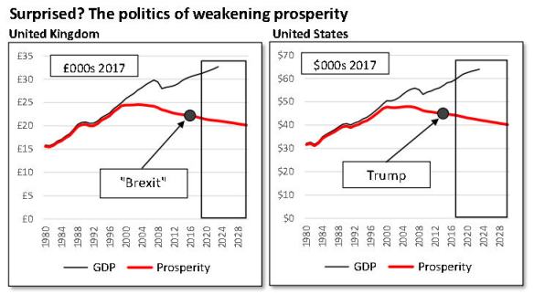
Obviously, economic hardship wasn’t the only issue at stake in either case. But it has to be highly likely that it tipped the balance. Similarly, recent events in Italy must in large part reflect a big (12.1%, or €3,300) slump in average prosperity per person since 2001 – which, coincidentally (or not?) was the year before Italy joined the euro.
In short, the SEEDS interpretation is that the rise of so-called “populism” across much of the West reflects a deterioration in prosperity which conventional economics is wholly unable to capture.
This means that policymakers are trying to make decisions in a context quite different from the information that they have to go on.
The main purpose of SEEDS isn’t political prediction, though the system’s track-record in this field is rather impressive. Rather, the aim is to calibrate prosperity – something which conventional economics has become increasingly unable to do – and to draw economic and financial conclusions on this basis.
China – some warning signs
The next pair of charts, which look at China, display SEEDS’ interpretative capability on an issue of current importance. The first chart illustrates that, whilst GDP per capita continues to grow at rates of over 6% per annum, prosperity is increasing at a much more sedate pace, trending higher at rates of around 2% annually.

Meanwhile, and as shown in the second chart, China is paying a huge price for growth in GDP, having added RMB 4.30 of net new debt for each RMB 1.00 of reported growth over the last ten years. Put another way, a large proportion of “growth” in recorded GDP amounts to nothing more than the simple spending of borrowed money.
This is by no means unique to China, of course. Before 2008, pouring credit into the economy, and calling the result “growth”, was a practice largely confined to the West. Since GFC I, this practice has spread to much of the emerging world.
Meanwhile, the West has moved on to new follies. To the “credit adventurism” which preceded the first crash has been added the even more dangerous “monetary adventurism” which is likely to trigger the second.
Watching this progression, you might well conclude that those deciding policy are ‘making it up as they go along’. That, of course, is about all they can do, if the interpretations on which they base their thinking have ceased to be valid.
Risk recalibrated
Where China is concerned, SEEDS puts a wholly different slant on risk exposure. The ratio of debt to prosperity has climbed from 217% back in 2007 to 613% now, and is set to reach 660% by the end of this year. These compare with debt-to-GDP ratios of 162% in 2007, and 309% now.
You don’t need to be unduly pessimistic to appreciate that this trajectory has become wholly unsustainable – and by no means just in China. Yet this scale of risk is something that the preferred conventional measure – the ratio of debt to GDP – simply fails to capture. Much the same applies to the measurement of systemic risk in banking, where comparing financial assets with prosperity shows levels of risk far higher than are indicated by ratios based on GDP.
This is a subject for a future discussion, but we can observe here that countries whose banking systems are disproportionately large are living with exposure whose severity cannot be measured realistically with established techniques.
Debt mis-measured
The explanation for the mismatch in debt ratios, by the way, is pretty simple. Much of any increase in debt finds its way into expenditure, thus pushing up apparent GDP in a way which damps down the measured implications of debt escalation. As we’ll see, where SEEDS differs is that it uses underlying or “clean” output numbers, adjusted to exclude the way in which GDP is boosted by the simple spending of borrowed money.
Given the sheer scale of worldwide borrowing in recent years, understanding how the conventional debt-to-GDP measure is flawed helps us to appreciate why the next financial crisis (“GFC II”), when it comes, will doubtless be regarded as just as much of an ‘unpredictable’ event as the 2008 global financial crisis (GFC). Though there are many ‘popular misconceptions’ in this area (including the ‘safety’ supposedly conferred on the banking system by higher reserve ratios), the debt-to-GDP ratio remains one of the most misleading of the lot.
The reality is that, far from taking us by surprise, many events and trends are eminently predictable. Looking back at the British chart, for instance, you’ll readily appreciate why customer-facing sectors such as retailing, pubs and restaurants are going through a fire-storm of failures and closures. Contrary to ‘expert’ opinion, this melt-down owes very little to “Brexit” (yet, anyway), and almost everything to the erosion of customers’ ability to spend.
Globally, SEEDS reveals levels of risk exposure that are very different from anything you can glean from conventional econometrics. Taking debt as an example, the ratio of debt to world GDP now stands at 215% of GDP, a ratio not dramatically worse than it was in 2007 (179%). For SEEDS, though, the ratio of debt to prosperity is not only much higher (327%) than the conventional measure, but has worsened very markedly since 2007 (229%).
How, then, does SEEDS arrive at these conclusions?
“Something missing”
Put simply, SEEDS fills a gaping hole in how the economy is understood. It’s become increasingly clear, over an extended period, that the ability of conventional economics to provide interpretation and guidance has been breaking down. Policy levers that once worked pretty well seem now to have lost their effectiveness. This means that individuals and businesses, no less than governments, are unable to grasp what is really going on in the economy and finance.
Since the interpretive and predictive abilities of conventional economics are failing, it’s clear that “something is missing” from accepted thinking. Equally clearly, this missing component has now assumed greater importance than it had in the past. So what we’re for looking is a gap in understanding which is more important today than it was, say, twenty years ago.
The view taken here is that the missing ‘something’ is energy. There are at least two reasons why this ought to come as no surprise at all.
First, it’s observable, throughout history, that three data series have progressed in something very close to lock-step. These series are: energy consumption; population numbers; and the economic output that supports that population. From the late 1700s, when first we accessed the huge amounts of energy tied up in fossil fuels, all three series have become exponential. This is illustrated in the next chart, which compares population and energy consumption over two millenia. (For much of the early period, energy wasn’t traded, so we can’t quantify exactly how much was used, but we do know that the numbers were extremely small).

Second, you only have to picture an economy suddenly starved of power to appreciate quite how utterly dependent all economic, financial, social and political systems are on the continuity of energy supply. Cut off this supply in its entirety for as little as 24 hours and chaos would ensue. It’s likely that a relatively short period without energy would be enough to turn chaos into collapse.
Both observations are so obvious that the absolute primacy of energy in the economy should be clear to everyone. The idea that energy is somehow ‘just another input’ is facile in the extreme. There is literally no service or commodity than can be supplied without it. Clearly, energy is much more important than just one a part of a sub-set of materials, itself one of the five inputs to economic activity (the others being labour, capital, knowledge and management).
What has changed?
We can be confident, then, that energy is the ‘something’ that is missing from the conventional understanding of the economy. Equally, though, if it’s missing now, then it was missing in the past, too – yet its absence has become more important over time.
So it’s not just energy itself that has been left out of the equation, but something dynamic (changing) within energy itself.
A long-standing interpretation of the energy economy has been scarcity. It’s logical that reserves of fossil fuels are finite; that consumption has increased exponentially over time; and that we’ve exploited the most economically attractive resources first, leaving less profitable alternatives for later. This process is known as depletion, and is the logic informing ‘peak oil’ – a thesis that ‘cornucopians’ dispute, but which may yet turn out to have been right all along.
The critical issue – cost
SEEDS, though, isn’t based on resource exhaustion. Where the critical role of energy is concerned, the alternative (though not necessarily conflicting) interpretation is that it’s cost, rather than quantity, which is critical.
Whenever we access energy, some of that energy is always consumed in the access process, and what remains – surplus energy – is the enabler of all economic activity, other than the supply of energy itself.
This relationship is often measured as a ratio known as EROEI (the Energy Return on Energy Invested, sometimes abbreviated EROI). The scientific argument supporting EROEI is compelling, and is stated superbly here.
SEEDS uses an alternative measure, ECoE (the Energy Cost of Energy), which expresses cost as a percentage of the gross energy accessed.
Because the world economy is a closed system, ECoE is not directly analogous to ‘cost’ in the usual financial sense. Rather, it is an economic rent, limiting the choice we exercise over any given quantity of energy. If we have 100 units of energy, and the ECoE is 5%, we exercise choice (or ‘discretion’) over 95 units. If ECoE rises to 10%, we now have discretion over only 90 units, even though the gross amount remains 100.
This is loosely analogous to personal prosperity. If someone’s income remains the same, but the cost of essentials rises, that person is worse off, even though income itself hasn’t changed.
Understanding ECoE
ECoE evolves over time. In the early stages of any given resource, ECoE is driven downwards by geographic reach, and by economies of scale. Once maturity is reached, depletion takes over as the driver, pushing ECoE upwards.
In the pre-maturity phase, technology accelerates the fall in ECoE driven by reach and scale. Post-maturity, technology acts to mitigate the rise caused by depletion. But – and this is often misunderstood – the capabilities of technology are limited to the envelope of the physical characteristics of the resource.
Over time, the trend in ECoE is parabolic (see illustration). Today, renewables remain on the downwards slope, but the ECoEs of fossil fuels are now emphatically on the upwards curve.
The same is true of overall ECoE, because fossil fuels still account for nearly 90% of energy supply, whilst renewables contribute less than 4%.

Even though renewables’ share of total energy supply is rising, it’s unlikely that this will stem, let alone reverse, the upwards trend in overall ECoE. Critically, technologies such as wind and solar power remain substantially dependent on inputs sourced from ‘legacy’ energy. We have yet to demonstrate that we can build solar panels, wind turbines or their associated infrastructure without recourse to energy from oil, gas or coal.
To this extent, the outlook for ECoEs in the renewables sector remains geared to the ECoEs of fossil fuels.
A critical point here is that, once on the upwards slope of the parabola, the rise in ECoE is exponential. According to SEEDS, global ECoE has risen from 3.5% in 1998 to 5.4% in 2008 and 8.0% now, and is projected to reach 10% by 2028.
For obvious reasons, details of the ECoE calculations used by SEEDS are not disclosed. This said, separate trajectories for fossil fuels and renewables are published, as are the global ECoE curve, and its national equivalents. (The aim is to give readers the maximum information consistent with not enabling any organisation to build a SEEDS-type system).
Some pointers, however, can be provided.
First, ECoEs are calculated on a fuel-by-fuel basis over time.
Second, and reflecting the nature of the main drivers, ECoEs evolve gradually, so SEEDS always cites trend ECoEs.
Third, the ECoE for any given country at any given moment, and the way in which this number changes over time, are determined by the mix of energy sources used, and by trade effects, where the country is a net importer or exporter of energy.
Relating ECoE to output – clean GDP
With ECoE established, it might appear that all we need to do now is deduct this number from GDP to arrive at prosperity, which is the corollary of surplus energy, expressed in monetary units.
Unfortunately, things are not this simple.
As we’ve seen, the tendency over an extended period has been to boost apparent GDP though processes known here as credit and monetary adventurism. The adoption of these policies can be seen, in part at least, as a response to a deterioration in rates of growth which began to take effect in or around the late 1990s, as rising ECoEs started to bite.
Comparing 2008 with 2000, reported “growth” of $26 trillion was accompanied by a $58tn increase in debt. The ratio between the two was thus $2.20 of new debt for each $1 of reported growth, though ratios were far higher than this in most Western economies.
Between 2008 and 2017, the ratio of borrowing to growth rose to 3.26:1, with $94tn of debt added alongside growth of $29tn. Furthermore, the latter period also witnessed the emergence of enormous shortfalls in the adequacy of pension provision, which have worsened by close to $100tn since 2008. This destruction of pension value is almost wholly attributable to a policy-induced collapse in returns on investment.
It almost defies credulity that we are asked to accept “growth” of $29tn as genuine whilst ignoring $94tn of net new debt, $28tn of newly-created QE liquidity and the destruction of almost $100tn of pension value.
According to SEEDS, real growth over that period wasn’t $29tn but $9.9tn, and even this calculation might be generous when set against the scale at which the aggregate balance sheet has been trashed over that period.
This calculation also means that GDP, reported at $127tn for 2017, falls to just $90tn on a clean, ex-manipulation basis – and even this, of course, is before we allow for ECoE, whose global cost has increased by 58%, from $4.5tn in 2008 to $6.9tn last year.
The following charts illustrate this situation, expressed in PPP-converted dollars at constant 2017 values. The left-hand chart shows GDP, both as reported and as adjusted by SEEDS to exclude the impact of the simple spending of borrowed money. The second chart shows debt, both as actual numbers and as the trend that would have occurred had debt grown at the same annual rates as reported GDP.
The difference between the red and black debt lines thus corresponds to debt growth in excess of percentage increases in GDP.

When examining these charts, it’s important to note the differences in the vertical axes, meaning that we’re dealing with movements at different orders of magnitude.
Between 2000 and 2017, GDP (as reported) increased by $55tn (76%) in real terms. But debt more than doubled, growing by 126%, or $152tn, from $121tn in 2000 to $273tn in 2017.
Borrowing $152tn to achieve growth of $55tn is not only unsustainable, but surely makes it clear beyond doubt that most of the supposed “growth” in GDP is simply the effect of pouring borrowed liquidity into the economy.
Implications of credit-fuelled GDP
From this, two things follow. The first is that a cessation of debt escalation would reduce growth dramatically – if debt ratios remained at current levels, no longer increasing, then GDP might continue to expand, but probably at rates of barely 1% annually, compared to the 3% and more claimed by reported numbers. Without continued increases in indebtedness, GDP could be expected to fall in most Western economies, whilst rates of growth in the emerging economies would slow markedly.
The second is that, if the excessive borrowing of recent years were to be reversed, GDP would slump, laying bare the extent to which the “growth” recorded since 2000 has been debt-inflated. On this latter point, debt stood at 168% of GDP in 2000, and now stands at 215%. Getting back to the 168% level would require deleveraging of almost $60tn, and the consequences of this for GDP are best left to the imagination.
If you put this $60tn figure alongside the scale of QE (about $28tn) – and add the massive (perhaps $100tn) of pension adequacy impairment, too – you’ll see how far out of reach any definition of financial ‘normality’ really is.
For all practical purposes, we are stuck with negative (sub-inflation) interest rates, ultra-cheap credit and negligible returns on invested capital until this combination of forces reaches its logical conclusion.
Corroboration
The calculation of ‘clean’ – ex-borrowing – output is undertaken using an algorithm which it would be folly to disclose, because to do so would be to hand an important methodology to those who don’t have an equivalent (though, pretty obviously, they need one).
But this doesn’t mean that we’re without at least three forms of corroborative evidence.
The first is to be found in the content of the “growth” reported in recent years. Data for the United States for the period between 2006 and 2016 illustrates this point.
Over that period, the American economy grew by $2.3tn at constant values. Of this growth, increases in the net export of services contributed 7%, or $159bn. The remaining 93% ($1.97tn) came from internally-consumed services (ICS), including finance and real estate (+$628bn) and government activity (+$272bn, excluding transfer payments).
Together, the combined contribution to this growth from globally-marketable output (GMO) – that is, manufacturing, construction, agriculture and the extractive industries, all of which are traded on a worldwide basis – was zero.
In other words, virtually all growth has occurred in activities where Americans pay each other for services that cannot be marketed to foreign customers. This is the classic profile of an economy relying for growth on ramping up its debt.
This has by no means been a phenomenon limited to the United States. Rather, it’s been visible across the West. In the emerging economies, and especially in China, the pattern has been different, with borrowed funds being channelled into the creation of capacity. But this borrowing, too, inflates consumption, because these activities act as conduits which push borrowed money into the pockets of those employed building capacity.
A second way of corroborating the debt-funded nature of reported “growth” is to examine the circumstances of the average person. If GDP growth (and, therefore, its per capita equivalent) was organic and sustainable, prosperity would be rising as well. That this isn’t the case is apparent in various metrics. One of these is real wages, and another is the comparison between incomes and the cost of essentials.
Critically, debt per person has risen by much more than per capita GDP, something which isn’t consistent with the improving prosperity implied by reported GDP. Again using the United States as an example, and stating all numbers at 2017 values, GDP per capita increased by 6.5%, or $3,620, between 2007 and 2017. But debt per capita was $22,400 (18%) higher at the end of 2017 than it had been ten years earlier.
Prosperity
To get from GDP to prosperity, then, two stages are involved. The first is to arrive at a ‘clean’ GDP number by removing the distortions introduced by pouring cheap credit into consumption. The second is to deduct ECoE from this underlying number.
The results show a deterioration in prosperity across all major Western economies other than Germany. Typically, Western citizens are getting poorer at rates of between 0.5% and 1% annually.
Moreover, the share of debt – personal, business and government – that these citizens are required to support on the back of dwindling prosperity has grown markedly. Because servicing this debt at normal (above-inflation) interest rates has become impossible, we are locked into monetary policies which are themselves destructive.
Though the citizens of emerging economies continue to enjoy increasing prosperity, their debt, too, is rising. For example, the average Chinese person is 41% more prosperous than he or she was back in 2007 – but the per capita equivalent of debt has quadrupled over the same period.
Worldwide, continued growth in EM prosperity has matched the deterioration in the developed West, meaning that average prosperity has flat-lined – but the ratio of debt to world prosperity has continued to rise markedly.
So, globally, we’re not getting richer, and we’re not getting poorer – but we are getting ever further into debt, whilst pension provision is falling ever further away from where it ought to be.
In short, SEEDS concludes that a string of observations often taken for granted are simply misleading. Output per capita isn’t growing, and most Westerners are getting poorer, not richer.
Take these observations on board and a lot of things that might have seemed inexplicable – including political outcomes, rising trade conflicts and many other stresses – all of a sudden fit into a logical pattern.
And it’s a pattern that‘s looking ever less sustainable.
= = = =
