IS ‘SUSTAINABLE DEVELOPMENT’ A MYTH?
For a long time now, “sustainable development” has been the fashionable economic objective, the Holy Grail for anyone aiming to achieve economic growth without inducing catastrophic climate degradation. This has become the default position for two, very obvious reasons. First, no politician wants to tell his electorate that growth is over (even in countries where, very clearly, prosperity is now in decline). Second, policymakers prepared to invite ridicule by denying the reality of climate change are thin on the ground.
Accordingly, “sustainable development” has become a political article of faith. The approach seems to be to assume that sustainable development is achievable, and use selective data to prove it.
Where this comfortable assumption is concerned, this discussion is iconoclastic. Using the tools of Surplus Energy Economics, it concludes that the likelihood of achieving sustainable development is pretty low. Rather, it agrees with distinguished scientist James Lovelock in his observation that sustainable retreat might be the best we can expect.
This site is dedicated to the critical relationship between energy and economics, but this should never blind us to the huge threat posed by climate change. There seems no convincing reason to doubt either the reality of climate change science or the role that emissions (most obviously of CO²) are playing in this process. As well as counselling sustainable retreat, James Lovelock might be right, too, in characterising the earth as a system capable of self-regeneration so long as its regenerative capabilities are not tested too far.
False comfort
Economics is central to this debate. Here, comparing 2016 with 2001, are some of the figures involved;
Real GDP, 2016 values in PPP dollars:
2001: $73 trillion. 2016: $120tn (+65%)
Energy consumption, tonnes of oil equivalent:
2001: 9.5bn toe. 2016: 13.3bn toe (+40%)
Emissions of CO², tonnes:
2001: 24.3bn t. 2016: 33.4bn t (+37%)
If we accept these figures as accurate, each tonne of CO² emissions in 2001 was associated with $2,990 of GDP. By 2016, that number had risen to $3,595. Put another way, 17% less CO² was emitted for each $1 of GDP. By the same token, the quantity of energy required for each dollar of GDP declined by 15% over the same period.
This is the critical equation supporting the plausibility of “sustainable growth”. If we have really shown that we can deliver successive reductions in CO² emissions per dollar of GDP, we have options.
One option is to keep CO² levels where they are now, yet still grow the economy. Another is to keep the economy where it is now and reduce CO² emissions. A third is to seek a “goldilocks” permutation, both growing the economy and reducing emissions at the same time.
Obviously, the generosity of these choices depends on how rapidly we can continue our progress on the efficiency curve. Many policymakers, being pretty simple people, probably use the “fool’s guideline” of extrapolation – ‘if we’ve achieved 17% progress over the past fifteen years’, they conclude, ‘then we can expect a further 17% improvement over the next fifteen’.
Pretty lies
But what if the apparent ‘progress’ is illusory? The emissions numbers used as the denominator in the equation can be taken as accurate, as can the figures for energy consumption. Unfortunately, the same can’t be said of the economic numerator. As so often, we are telling ourselves comforting untruths about the way in which the world economy is behaving.
This issue is utterly critical for the cause of “sustainable development”, whose plausibility rests entirely on the numbers used to calculate recent trends.
And there are compelling reasons for suspecting the validity of GDP numbers.
For starters, apparent “growth” in economic output seems counter-intuitive. According to recorded numbers for per capita GDP, the average American was 6% better off in 2016 than in 2006, and the average Briton was 3% more prosperous. These aren’t big numbers, to be sure, but they are positive, suggesting improvement, not deterioration. Moreover, there was a pretty big slump in the early part of that decade. Adjustment for this has been used to suggest that people are growing more prosperous at rates faster than the trailing-10-year per capita GDP numbers indicate.
Yet the public don’t buy into the thesis of “you’ve never had it so good”. Indeed, it isn’t possible reconcile GDP numbers with popular perception. People feel poorer now than they did in 2006, not richer. That’s been a powerful contributing factor to Americans electing Donald Trump, and British voters opting for “Brexit”, crippling Theresa May’s administration and turning in large numbers to Jeremy Corbyn’s collectivist agenda. Much the same can be said of other developed economies, including France (where no established party made it to the second round of presidential voting) and Italy (where a referendum overwhelmingly rejected reforms proposed by the then-government).
Ground-level data suggests that the popular perception is right, and the per capita GDP figures are wrong. The cost of household essentials has outpaced both incomes and general inflation over the past decade. Levels of both household and government debt are far higher now than they were back in 2006. Perhaps worst of all – ‘though let’s not tell the voters’ – pension provision has been all but destroyed.
The pension catastrophe has been attested by a report from the World Economic Forum (WEF), and has been discussed here in a previous article. It is a topic to which we shall return in this discussion.
The mythology of “growth”
If we understand what really has been going on, we can conclude that, where prosperity is concerned, the popular perception is right, meaning that the headline GDP per capita numbers must be misleading. Here is the true story of “growth” since the turn of the century.
Between 2001 and 2016, recorded GDP grew by 65%, adding $47tn to output. Over the same period, however, and measured in constant 2016 PPP dollars, debt increased by $135tn (108%), meaning that each $1 of recorded growth came at a cost of $2.85 in net new borrowing.
This ratio has worsened successively, mainly because emerging market economies (EMEs), and most obviously China, have been borrowing at rates far larger than growth, a vice previously confined to the developed West.
This relationship between borrowing and growth makes it eminently reasonable to conclude that much of the apparent “growth” has, in reality, been nothing more substantial than the spending of borrowed money. Put another way, we have been boosting “today” by plundering “tomorrow”, hardly an encouraging practice for anyone convinced by “sustainable development” (or, for that matter, sustainable anything).
Nor is this all. Since the global financial crisis (GFC) of 2008, we have witnessed the emergence of enormous shortfalls in society’s provision for retirement. According to the WEF study of eight countries – America, Australia, Britain, Canada, China, India, Japan and the Netherlands – pension provision was deficient by $67tn in 2015, a number set to reach $428tn (at constant values) by 2050.
Though the study covers just eight countries, the latter number dwarfs current GDP for the entire world economy ($120tn PPP). The aggregate eight-country number is worsening by $28bn per day. In the United States alone, the annual deterioration is $3tn, equivalent to 16% of GDP and, incidentally, roughly five times what America spends on defence. Moreover, these ratios seem certain to worsen, for pension gaps are increasing at annual rates far in excess of actual or even conceivable economic growth.
For the world as a whole, the equivalent of the eight-country number is likely to be about $124tn. This is a huge increase since 2008, because the major cause of the pensions gap has been the returns-destroying policy of ultra-cheap money, itself introduced in 2008-09 as a response to the debt mountain which created the GFC. Finally, on the liabilities side, is interbank or ‘financial sector’ debt, not included in headline numbers for debt aggregates.
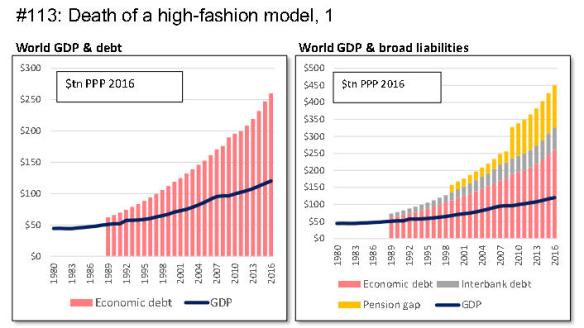
Together, then, liabilities can be estimated at $450tn – $260tn of economic debt, about $67tn of interbank indebtedness and an estimated $124tn of pension under-provision. The equivalent number for 2001 is $176tn, expressed at constant 2016 PPP values. This means that aggregate liabilities have increased by $274tn over fifteen years – a period in which GDP grew by just $47tn.
The relationship between liabilities and recorded GDP is set out in the first pair of charts, which, respectively, set GDP against debt and against broader liabilities. Incidentally, the pensions issue is, arguably, a lot more serious than debt. This is because the real value of existing debt can be “inflated away” – a form of “soft default” – by governments willing to unleash inflation. The same cannot be said of pension requirements, which are, in effect, index-linked.
Where climate change is concerned, what matters isn’t so much the debt or broader liability aggregates, or even the rate of escalation, but what they tell us about the credibility of recorded GDP and growth.
Here, to illustrate the issues involved, are comparative annual growth rates between 2001 and 2016, a period long enough to be reliably representative:
GDP: +3.4% per year
Debt: +5.0%
Pension gap and interbank debt: +9.1%
To this we can add two further, very pertinent indicators:
Energy consumption: +2.2%
CO² emissions: +2.1%
The real story
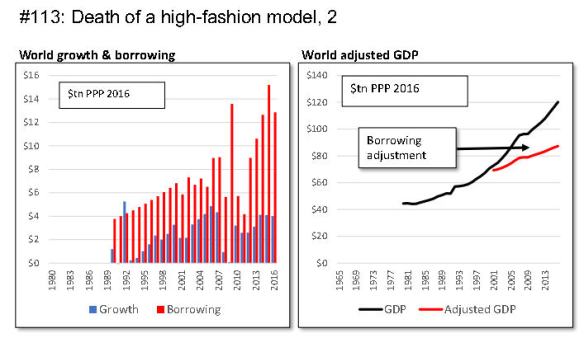
As we have seen, growth of $47tn in recorded GDP between 2001 and 2016 was accompanied – indeed, made possible – by a vast pillaging of the balance sheet, including $135tn in additional indebtedness, and an estimated $140tn in other liabilities.
The only realistic conclusion is that the economy has been inflated by massive credit injections, and by a comparably enormous unwinding of provisions for the future. It follows that, absent these expedients, organic growth would have been nowhere near the 3.4% recorded over the period.
SEEDS – the Surplus Energy Economics Data System – has an algorithm designed to ex-out the effect of debt-funded consumption (though it does not extend this to include pension gaps or interbank debt). According to this, adjusted growth between 2001 and 2016 was only 1.55%. As this is not all that much faster than the rate at which the population has been growing, the implication is that per capita growth has been truly pedestrian, once we see behind the smoke-and-mirrors effects of gargantuan credit creation.
This isn’t the whole story. The above is a global number, which embraces faster-than-average growth in China, India and other EMEs. Constrastingly, prosperity has actually deteriorated in Britain, America and most other developed economies. Citizens of these countries, then, are not imagining the fall in prosperity which has helped fuel their discontent with incumbent governing elites. The deterioration has been all too real.
The second set of charts illustrates these points. The first shows quite how dramatically annual borrowing has dwarfed annual growth, with both expressed in constant dollars. The second sets out what GDP would have looked like, according to SEEDS, if we hadn’t been prepared to trash collective balance sheets in pursuit of phoney “growth”. You will notice that the adjusted trajectory is consistent with what was happening before we ‘unleashed the dogs of cheap and easy credit’ around the time of the millenium.
Flagging growth – the energy connection
As we have seen, then, the very strong likelihood is that real growth in global economic output over fifteen years has been less than 1.6% annually, slower than growth either in energy consumption (2.2%) or in CO² emissions (2.1%). In compound terms, growth in underlying GDP seems to have been about 26% between 2001 and 2016, appreciably less than increases in either energy consumption (+40%) or emissions (+37%).
At this point, some readers might think this conclusion counter-intuitive – after all, if technological change has boosted efficiency, shouldn’t we be using less energy per dollar of activity, not more?
There is, in fact, a perfectly logical explanation for this process. Essentially, the economy is fuelled, not by energy in the aggregate, but by surplus energy. Whenever energy is accessed, some energy is always consumed in the access process. This is expressed here as ECoE (the energy cost of energy), a percentage of the gross quantity of energy accessed. The critical point is that ECoE is on a rising trajectory. Indeed, the rate of increase in the energy cost of energy has been rising exponentially.
As mature resources are depleted, recourse is made to successively costlier (higher ECoE) alternative sources. This depletion effect is moderated by technological progress, which lowers the cost of accessing any given form of energy. But technology cannot breach the thermodynamic parameters of the resource. It cannot, as it were, ‘trump the laws of physics’. Technology has made shale oil cheaper to extract than shale oil would have been in times past. But what it has not done is transform shales into the economic equivalent of giant, technically-straightforward conventional fields like Al Ghawar in Saudi Arabia. Any such transformation is something that the laws of physics simply do not permit.
According to estimates generated on a multi-fuel basis by SEEDS, world ECoE averaged 4.0% in 2001, but had risen to 7.5% by 2016. What that really means is that, out of any given $100 of economic output, we now have to invest $7.50, instead of $4, in accessing energy. The resources that we can use for all other purposes are correspondingly reduced.
In the third pair of charts, the left-hand figure illustrates this process. The area in blue is the net energy that fuels all activities other than the supply of energy itself. This net energy supply continues to increase. But the red bars, which are the energy cost of energy, are rising too, and at a more rapid rate. Consequently, gross energy requirements – the aggregate of the blue and the red – are rising faster than the required net energy amount. This is why, when gross energy is compared with economic output, the energy intensity of the economy deteriorates, even though the efficiency with which net energy is used has improved.

Here’s another way to look at ECoE and the gross/net energy balance. Back in 2001, we needed to access 104.2 units of energy in order to have 100 units for our use. In 2016, we had to access 108.1 units for that same 100 units of deployable energy. This process, which elsewhere has been called “energy sprawl”, means that any given amount of economic activity is requiring the accessing of ever more gross energy in order to deliver the requisite amount of net (surplus) energy. By 2026, the ratio is likely to have risen to 112.7/100.
The companion chart shows the trajectory of CO² emissions. Since these emissions are linked directly to energy use, they can be divided into net (the pale boxes), ECoE (in dark grey) and gross (the sum of the two). Thanks to a lower-carbon energy slate, net emissions seem to be flattening out. Unfortunately, gross emissions continue to increase, because of the CO² associated with the ECoE component of gross energy requirements.
Shot down in flames? The “evidence” for “sustainable development”
As we have seen, a claimed rate of economic growth (between 2001 and 2016) that is higher (65%) than the rate at which CO² emissions have expanded (37%) has been used to “prove” increasing efficiency. It is entirely upon these claims that the viability of “sustainable development” is based.
But, as we have also seen, reported growth has been spurious, the product of unsustainable credit manipulation, and the unwinding of provision for the future. Real growth, adjusted to exclude this manipulation, is estimated by SEEDS at 26% over that period. Crucially, that is less than the 37% rate at which CO² emissions have grown.
On this basis, a claimed 17% “improvement” in the amount of CO² per dollar of output reverses into a deterioration. Far from improving, the relationship between CO² and economic output worsened by 9% between 2001 and 2016. In parallel with this, the amount of energy required for each dollar of output increased by 11% over the same period.
The final pair of charts illustrate this divergence. On the left, economic activity per tonne of CO² is shown. The second chart re-expresses this relationship using GDP adjusted for the artificial “growth” injected by monetary manipulation. If this interpretation is correct – and despite a very gradual upturn in the red line since 2010 – the comforting case for “sustainable development” falls to pieces.
In short, if growth continues, rising ECoEs dictate that both energy needs, and associated emissions of CO², will grow at rates exceeding that of economic output.

We are back where many have argued that we have been all along. The pursuit of growth seems to be incompatible with averting potentially irreversible climate change.
There is a nasty sting-in-the-tail here, too. The ECoE of oil supplies is rising particularly markedly, and there seems a very real danger that this will force an increased reliance on coal, a significantly dirtier fuel. A recent study by the China University of Petroleum predicted exactly such a trend in China, already the world’s biggest producer of CO². As domestic oil supply peaks and then declines because of higher ECoEs, the study postulates a rapid increase in coal consumption to feed the country’s voracious need for energy. This process is most unlikely to be confined to China.
Where does this leave us?
The central contention here is that the case for “sustainable development” is fatally flawed, because the divergence between gross and net energy needs is more than offsetting progress in greening our energy mix and combatting emissions of harmful gases. “Sustainable development” is a laudable aim, but may simply not be achievable within the laws of physics as they govern energy supply.
If this interpretation is correct, it means that growth in the global economy can be pursued only at grave climate risk. A (slightly) more comforting interpretation might that the super-heated rate of borrowing, and the seemingly disastrous rate at which pension capability is being destroyed, might well crash the system before our obsession with ‘growth at all costs’ can inflict irreparable damage to the environment.


