#128: GFC II

THE ANATOMY OF THE NEXT CRASH

Surprising though it might seem, barely two weeks have elapsed since those of us who anticipate GFC II – the sequel to the 2008 global financial crisis (GFC I) – were in a very, very small minority.

Consensus opinion, backed to the hilt by conventional economics, said that no such event was going to happen. Rather, we had entered the sunny uplands of “synchronised growth”, and debt had ceased to be anything much to worry about.

Of course, events, in Italy and elsewhere, haven’t yet proved us right, or the consensus wrong. We remain in a minority, though one that seems to be becoming larger. But events should embolden us, and on two fronts, not one.

First, recent developments strengthen the case for GFC II, not because of their seriousness alone, but because – as will be explained here – they conform to a logical pattern that points towards a coming crisis.

Second, we’re being reminded of quite how far conventional economics is out of touch with reality. This, of course, will be proved decisively if – or when – GFC II does happen.

This, when you consider its implications, is really quite remarkable. Government, business and finance all place heavy reliance on a school of thought which decrees that the workings of the economy are entirely financial – so, if events prove this approach to have been wrong, the ramifications will be enormous.

Those of us who understand that, far from being a matter of money, the economy is an energy system, have a lot of work in front of us.

This seems like a good point at which to publish the promised brief summary of why GFC II is likely.

ECoE starts to bite

Here is one big difference which makes the two contesting views of the economy incompatible. For anyone who believes in money-based interpretation, there are few (if any) logical barriers to perpetual growth in prosperity.

From an energy perspective, however, there is every reason to doubt the feasibility of indefinite expansion on a finite planet.

To be quite clear about this, what is contended here is not that we will “run out of” either petroleum or of energy more broadly. Rather, the argument is that we are running out of cheap energy.

“Cheap”, in this context, does not refer to sums of money invested in the supply of energy. Rather, it refers to the quantity of energy consumed whenever energy is accessed.

The definition used here is the energy cost of energy, or ECoE. Throughout much of our industrial history, the trend in ECoE has been downwards. This trend, beneficial for growing prosperity, was driven by geographical reach, economies of scale and technology.

In recent times, however, both reach and scale have plateaued, and technology has become a mitigator of ECoE increase rather than an accelerator of ECoE decrease. The driver now is depletion.

According to SEEDS, the global trend ECoE was 1.7% in 1980, and 2.6% in 1990. The difference between the two numbers was modest, and neither was a material (or, to most observers, even a noticeable) head-wind to growth.

Because the operative trend is exponential, however, ECoE was close to 4% by 2000, and had now become large enough to start driving a wedge between economic expectation and economic outcome.

The dynamic of sequential crises, part one – GFC I

By about 2000, then, underlying growth in prosperity was weakening, something not helped by the form of globalisation being promoted. Fading growth wasn’t something that conventional economics could explain, let alone accept.

What was apparent, however, was that the ability of Westerners to go on increasing their consumption was flagging, not least because of the outsourcing of skilled, well-paid jobs to the emerging market economies (EMs).

The solution to this seemed simple – give consumers easier and cheaper access to credit.

Two expedients combined to further this aim. The first was to drive down the real (ex-inflation) cost of borrowing. The second was to increase the availability of debt through “deregulation” of the financial sector. Both accorded with the prevailing ideology of laissez-faire economics, with its emphasis on diminishing the role (including the regulatory role) of the state.

Obviously enough, this strategy drove global debt upwards. Expressed in PPP dollars at constant 2017 values, world debt increased by 43%, from $121 trillion in 2000 to $174tn in 2007. Nobody in any position of influence seemed unduly concerned about this, because GDP had increased by a seemingly-impressive 53% over the same period.

Hardly anyone seemed to notice that each $1 of this growth had been accompanied by $2.08 of net new debt. Accordingly, the clear inference – that a big chunk of this “growth” was nothing more substantial than the simple spending of borrowed money – passed largely unnoticed.

The second, less obvious consequence of deregulation was the diffusion of risk, and the separation of risk from return. Various innovative practices enabled the creation of high-return, high-risk instruments which could be sliced in such a way that high risk was divested and high return retained. Surprisingly few observers noticed quite how dangerous this practice was likely to prove.

Risk-aversion revisited

The first – and, with hindsight, unmistakeable – portent of GFC I happened during the “credit crunch” of 2007. Banks, suddenly aware of elevated risk, couldn’t know which counterparties were safe, and which were not.

This was an instance of risk-aversion. What resulted was an interruption in the continuity of credit supply. This took down the small number of banks which had been reckless enough to finance their lending using short-term credit from wholesale markets. These aside, the system seemingly recovered from risk-aversion, though astute observers must by now have realised that the “credit crunch” might well be a precursor to something more systemic.

This 2007 chapter is highly relevant now, because we have entered a new phase of risk-aversion. Even before recent events in Italy, some of us had discerned the rise of risk-aversion, most obviously in the travails of a string of EM currencies. The probability is that this isn’t simply a function of a strengthening dollar, but reflects the withdrawal of capital from countries now seen as risky.

This time – and with a significance that will become obvious shortly – it is the creditworthiness of countries and their currencies which are being questioned, not just that of banks

This is why, here, we had started discussing GFC II, and commenting on its imminence, well before anything kicked off in the Euro Area (EA).

These events have not, then, changed our expectations. Rather, they have conformed to a pattern in which an outbreak of risk-aversion precedes a full-blown crisis.

The dynamic of sequential crises, part two – GFC II

So far, the dynamic of GFC II is conforming to the pattern of GFC I, with an episode of risk-aversion happening first. If the pattern continues, we will get through this chapter and breathe a collective sigh of relief – just in time for GFC II to catch us unawares.

This time, though, the fundamental dynamic is different, which means that the shape of GFC II will be different as well.

The explanation for this lies in how we responded to GFC I.

Put simply, during GFC I the authorities woke up to the obvious fact that the world had too much debt. Whenever debt becomes excessive – for a household, a business or a whole economy – the primary problem isn’t whether the debt can be repaid. At the macroeconomic level, at least, repayment can usually be deferred.

The big and immediate problem is servicing the debt – and this, by 2008, had become something that the world’s borrowers simply couldn’t afford to do. The logical solution seemed to be to slash interest rates.

This involved two processes, not one. The first, which was to take policy rates down to somewhere near zero, would never have been enough on its own. This was why massive QE programmes were launched, buying bond prices upwards in order to force yields sharply lower.

Defenders of QE argued that this didn’t amount to “printing” or otherwise creating new money, that it wasn’t monetisation of debt, and that it wouldn’t spark a sharp rise in inflation.

None of these assurances was, or is, cast-iron. QE isn’t the creation of money so long as it is reversed in good time. QE may not in principle be debt monetisation, but it certainly has become that in Japan, where QE money has been used by the BoJ to buy up nearly half of all JGBs in issue. It would be no huge surprise if the ECB, too, adopted monetisation as the least-bad way out of the looming debt crisis. And QE need not spark inflation, if by that term is meant rises in retail prices – but QE most assuredly has created huge inflation in the prices of assets.

A new adventurism

Be that as it may, what we have seen since GFC I has been “monetary adventurism”, which is distinct from the “credit adventurism” practised before 2008. The credit variety hasn’t gone away – indeed, it has worsened, with each dollar of “growth” since 2008 coming at a cost of $3.39 in new debt, compared with a ratio of 2.08:1 before GFC I – but monetary adventurism has leveraged its consequences.

The numbers are that, between 2008 and 2017, GDP increased by $28.8tn, but debt expanded by $98tn. Nor is this all. The destruction of returns on capital has created what the WEF has called “a global pension timebomb”, blowing a hole estimated by SEEDS at close to $100tn in worldwide pension provision adequacy. QE has poured something of the order of $28tn into the system. In the background, meanwhile, ECoE has continued to tighten its grip, rising from 5.3% in 2007 to 8.0% now.

To cut to the chase, most of the recorded “growth” in world GDP since 2008 has been cosmetic, amounting to nothing more substantial than the simple spending of borrowed money. As we have seen, this is corroborated by the concentration of “growth” towards the lower end of the value-added spectrum.

Bring the increase in ECoE into the equation as well and what we are looking at is a 10% ($7.6tn) increase in world prosperity trying to support a 54% ($98tn) expansion in total debt. Moreover, the 10% increase in aggregate prosperity has barely matched the rate of growth in population numbers. People have not been getting more prosperous, then, but they have been getting ever further into debt.

What on earth could go wrong with that?

Not like GFC I – the nature of GFC II risk

Thus far, with an episode of risk-aversion in the EM economies compounded by debt worries in Europe, events are following the pattern of GFC I.

But there are at least three reasons why we should not assume that GFC II will continue to look a lot like GFC I.

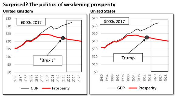
First, prosperity per person has been declining across almost all of the Western economies. The worst affected countries include France (a fall of 5.4% since 2007), Australia (-6.0%), the United States (-6.3%), Britain (-7.9%) and – of course – Italy, where prosperity has declined by 8.4%.

It is no coincidence at all that major political reverses for the establishment have happened in four of these five countries. Deterioration in prosperity seems certain to have informed the “Brexit” vote, the election of Mr Trump, the defeat of all established parties in the first round of presidential voting in France, and the triumph of Lega and M5S in Italy.

The relevance of this going forward, though, is something termed here “acquiescence risk”. This broadly means that populations undergoing hardship are likely to oppose any kind of rescue plan, especially if it is assumed by voters to involve rescues for an elite, and “austerity” for everyone else.

The second big difference between conditions now and those prevailing in 2008 is that recklessness has no longer been confined almost entirely to the developed economies of the West. This broader compass is hinted at by risk-aversion in the EMs. On the SEEDS risk matrix, China is now rated as riskier than any economy other than Ireland.

Third, and most important of all, a phase of “credit adventurism” which put banks at risk in 2008 has become a wave of “monetary adventurism” which puts fiat currencies themselves at risk.

What we should anticipate, then, is that GFC II will be truly global, not exempting EMs, and that, this time, currencies, and therefore national economies, will share a wave of risk previously (in 2008) borne largely by banks alone.

Precedent can help us anticipate why GFC II will happen – but will prove a poor guide to its shape and extent.

= = = = =

Since brevity was promised here, it is to be hoped that the foregoing provides a succinct summary of why GFC II is likely.

There seem certain to be plenty of opportunities for going into this in greater detail.


= = = = =

Brexit Trumpjpg_Page1

#127: Quantum of risk, part three

THE ITALIAN GAMBIT

Here’s a test of the imagination. First, picture someone asking you to write off a debt of €100,000 that he owes you. Next, picture this same man, with his next breath, asking if you will also act as guarantor of his next overdraft. Oh, and he would like to rewrite all the rules governing the financial relationship between you, too.

Though this stretches the imaginative faculty, it’s pretty much what the incoming Italian government is asking of the European Central Bank (ECB). As well as agreeing to write off €250bn of Italian public debt, the ECB is expected to watch benignly as Italy then embarks on a new fund-raising exercise, implicitly guaranteed by the ECB.

The chances of the ECB agreeing to this must be close to zero, not least because of the precedent that it would set for other Euro Area (EA) borrowers.

Yet it seems equally unlikely that the new coalition in Rome will back down over ambitious plans seemingly endorsed in large numbers by the electorate.

In short, what we have here are the makings of a full-blown EA financial (and political) crisis, yet the markets have seemed neither stirred nor shaken by it. Right now, the apparent softening of the Trump line on trade with China seems to be the only game in town. It may be a characteristic of markets that they can focus on only one issue at a time, and this might help explain seemingly relaxed reactions to events in Italy.

It doesn’t help that a media focus on “populism” is obscuring what is really happening as a new coalition prepares to take office in Rome.

The aim here is to investigate what might be called ‘the Italian gambit’. The main conclusion is that this situation is a direct result of systemic weaknesses within the Euro.

SEEDS – the Surplus Energy Economics Data System – is used here in two main ways.

First, SEEDS tracks the long-running erosion in prosperity which has led Italy to this juncture, discrediting the political establishment and paving the way for radicalism.

Second, SEEDS is also deployed to calibrate the degree of financial risk posed by Italy.

All change in Rome

Even if the fundamentals are improperly understood, what ought to be influencing bond markets now is a dawning recognition that genuine political change is on the cards. The sparring is over, and Italians really are about to get a radical new government, formed by a coalition of two parties, the Lega and the Five Star Movement (5S).

Both are often labelled “populist”, but the term preferred here is the more neutral ‘insurgent’, meaning ‘challengers to the established order’.

The new government certainly seems set to merit the ‘insurgent’ label, if what we know so far is anything to go by. Apparent plans to deport as many as 500,000 undocumented immigrants are likely to prove highly controversial, as are proposals for rolling back sanctions against Russia. The new administration may be hoping that its migrants plan might push its EU partners into taking a larger share of immigrants for whom Italy has been the primary point of entry. Relaxing or even scrapping sanctions on Russia, on the other hand, amounts to a direct challenge, not just to the EU but, implicitly at least, to the uneasily-shared stance of Europe and the United States.

But the real meat in the policy sandwich is economic and fiscal. What the new government appears to want is a major house-cleaning exercise, intended as the basis for radical reform of taxation, public expenditures and debt.

Essentially, the Lega and 5S are planning a repudiation of the Euro Area doctrine of austerity. Just one of the many snags with this is that Italy is already one of the most indebted governments in the EA.

On the revenue side, the coalition proposes a flat tax, levied at 15% and 20%, and offset by a flat €3,000 tax deduction. Planned increases in excise and sales taxes are to be scrapped, which alone will cost about €12.5bn (within current revenues of €800bn). A key spending plan is to introduce what looks a lot like a universal basic income (UBI) of €780 per month for poor families. The coalition is also likely to rescind the intention to start raising pension ages.

All of this is likely to push the fiscal deficit sharply higher, which is why the government will seek a relaxation of EA rules which restrict budget deficits to 3% of GDP. But this proposal is just the thin end of a wedge of challenges to the EA system.

Most strikingly, the coalition partners have called on the ECB to “forgive” (meaning write off) €250bn of Italian government bonds. They also plan to start issuing short-term credit notes (sometimes labelled ‘mini-bots’), which means that Italy will be adding to its public debt at the same time as asking a big creditor to let it off the hook.

How did things get to this impasse?

The Euro – faults in the system

We should be in no doubt that the challenge to the architecture of the Euro system being posed by the incoming Italian government needs to be taken extremely seriously.

Fundamentally, this situation is a direct consequence of weaknesses in the Euro system. From the outset, a model which combines a single monetary system with a multiplicity of sovereign budgets has always been an exercise in economic illiteracy, and a clear case of political ambition trumping economic realism. Putting politics ahead of economic reason usually comes at a price – and, for the Euro system, Italy is about to present the bill.

Here’s how the faults in the Euro have led Italy to where she is now. Over a very extended period, Italian competitiveness has eroded. Before Italy joined the Euro in 2002, gradual devaluation acted as a cushion, shielding Italians from the worst effects of diminishing competitiveness. With each successive decline in the value of the lira, living standards decreased slightly (which is a stealthy sort of “austerity”), in line with rises in the cost of imports. But this very modest (and, incrementally, barely-noticeable) inflationary impact on prosperity was more than countered by falls in the relative prices of Italian goods and services, supporting jobs and activity in the Italian economy.

Abruptly, however, joining the Euro took away this long-standing cushion of stealthy devaluation. Critically, loss of the ability to devalue was not countered by the automatic stabilisers customarily provided by the combination of monetary and fiscal systems.

These stabilisers work like this. If, for example, the economy of northern England were to deteriorate, whilst that of the south was prospering, southerners would pay more tax and receive less benefits, whilst the reverse would happen in the north. This process creates transfers between prospering and struggling regions which help to counter imbalances created by divergences in competitiveness. Most importantly, this process happens automatically in any properly-functioning monetary area, and does not require decisions by government.

No such automatic process exists in the Euro area. Denied the ability to devalue, and without the cushion of automatic stabilisers, the only way that a country like Italy can defend its competitiveness is through a process of internal devaluation, whereby the costs of production (essentially, wages) are reduced. This process has become synonymous with “austerity”, and the unmistakable lesson of recent political events is that Italians want no more of it.

Prosperity and risk – the SEEDS reading

SEEDS analysis underscores an interpretation based on dwindling prosperity within the straitjacket of monetary inflexibility.

According to SEEDS, average prosperity in Italy peaked in 2001 (on the eve of Euro membership), and Italians have been getting poorer ever since the country joined the Euro. Prosperity in 2017 is put at €24,130 per person (compared with GDP per capita of €28,300), and the average Italian is now €2,680 worse off than he or she was ten years ago. The trend decline in average prosperity is 0.4%. Though not drastically out of line with what is happening in some comparable countries, this is certainly bad enough to sustain popular discontent.

From this, you can see why developments in Italy are likely to become a direct challenge to the Euro, even though the incoming administration in Rome hasn’t – quite – committed itself to debating Euro membership. Assuming that neither the ECB nor the new Italian government gives way, what may very well result is a rethink of Italy’s membership of the single currency.

Nothing encompassed by this confrontation can possibly stop at the Italian border, making this a challenge which far exceeds the implications of “Brexit” for the EU.

SEEDS and the quantification of risk

As well as underlining the decline in prosperity which has pushed Italy to this impasse, SEEDS can also calibrate the level of risk involved. Interestingly, Italy doesn’t come out too badly on some of the risk metrics applied by SEEDS. But the last of the four metrics contradicts this finding in very serious ways.

For starters, Italy does not score too badly on financial exposure tests. With aggregate prosperity of €1.46 trillion – 15% below reported GDP – debt, at 245% of GDP, equates to 288% of prosperity, a number that is not particularly high compared with similar economies.

Likewise, financial assets (a measure of the size of the banking system) are estimated at 465% of prosperity (and just under 400% of GDP). This, again, is not a worrying outlier.

Third, and despite its reputation as a highly indebted economy, Italy’s credit dependency is comparatively modest, with annual borrowing averaging 1.9% of GDP over the last ten years. Other countries would suffer a lot more than Italy from any interruption to the continuity of credit.

Italy doesn’t score too badly, then, on three of the four main benchmarks used by SEEDS for risk assessment:

  • Debt/prosperity (Italy 288% versus an EA average estimated at 300%)
  • Financial assets/prosperity (465% for Italy, against an EA average close to 600%, which reflects very large exposure in countries such as Ireland and the Netherlands)
  • Credit dependency – measured in relation either to GDP or prosperity, this calibrates exposure to disruptions in credit flow, a metric on which Italy isn’t badly exposed.

There are, though, two very major flies in this ointment.

First, Italy scores badly on the fourth SEEDS risk metric, which is “acquiescence risk”. What this means is the willingness of the public to support measures which might be both necessary and unpalatable.

Even if it were not already clear (from election results) that Italians have lost patience with anything which sounds like austerity, a decline in prosperity of 12% since a peak as long ago as 2001 can only have eroded voters’ preparedness to go along with the sort of painful proposals which might emerge from conventional politics. On “acquiescence risk”, then, SEEDS puts Italy in a pretty high-risk category.

As well as “acquiescence risk”, the second snag lies in the quality (rather than the scale) of the Italian banking system, where anecdotal evidence suggests a very high level of potential toxicity.

What happens now?

As we have seen, Italy’s central problem is an inability to address competitiveness through conventional devaluation, forcing the country into the painful process of internal devaluation known as “austerity” instead.

Just as monetary rigidity has been a major cause of these problems, it also complicates any search for a solution. Were Italy monetarily sovereign, the issues would at least have the merit of clarity. Bonds yields would soar and the currency would weaken, effects which might very well be enough, in themselves, to deter the new government from pushing ahead with its plans.

As a member of the EA, however, the stresses shift from the bond and FX markets to the arena of politics. It has hard to see how the ECB and the EA authorities can possibly give ground over the apparent demands of the incoming government in Rome, not least because whatever might be conceded to Italy could prove almost impossible to deny to others such as Greece, Portugal, Ireland and Spain.

Seen, as it must be, as a test case, the likelihood has to be that, far from helping Italy to restore la dolce vita, the EA might have to take a tough line on Italians continuing to accept la vita dura represented by “austerity”.

The next move will then be up to Rome, with the new government having to decide whether to succumb to EA diktats, or ask voters to support unilateral action.

This story will run, then, and the stakes – for the Euro, as well as for Italy – could hardly be higher.


Please note: the latest SEEDS dataset for Italy has been placed on the resources page.


#126: What’s next for SEEDS?

THOUGHTS ON FUTURE USE

With SEEDS (the Surplus Energy Economics Data System) now fully operational, it seems logical to wonder about the uses to which it can or should be put. If this discussion doesn’t provide answers, it can, at least, set out some thoughts which might be of interest. As ever, readers’ comments will be very welcome.

For starters, SEEDS wasn’t built with any commercial end in view, still less from any wish to influence policy. Rather, the aim of the project was “to see if it could be done” – could the principles of an economy determined by energy (and not, fundamentally, by money) form the basis of a new way of interpreting events, and forecasting outcomes?

Accomplishing this turned out to be even more difficult than had seemed likely at the outset.

I was prepared for the ‘linguistic’ challenge of expressing energy-based concepts in the financial language customarily used in economics.

But what I had not anticipated was the extent to which, even within the purely financial sphere, it would be necessary to reimagine much that is taken for granted within conventional approaches to the economy.

Outcome

Whether SEEDS has succeeded is a matter for others to judge, and the real ‘verdict’ on the effectiveness of the system is likely, in any case, to be delivered by events. But there do seem to be sound reasons for cautious optimism.

If conventional economic interpretation is correct, what we should have been seeing, long before now, ought to have been a combination of steadily improving prosperity and progressively diminishing risk.

The SEEDS interpretation, in stark contrast to this, is that prosperity has plateaued on a global basis – and has gone into reverse in most advanced economies – whilst risk continues to increase.

Moreover, SEEDS differs starkly from the consensus in pointing unmistakeably to a sequel (here called “GFC II”) to the global financial crisis (GFC I) of 2008.

It isn’t going to be all that long before we find out which interpretation is the right one.

Prosperity examined

What can be done, here and now, is to give you a single example of SEEDS interpretation which you can compare with the consensus or conventional view.

The British economy serves as well as any for illustrative purposes.

Comparing 2017 with 2007 – and with all numbers expressed at constant 2017 values – the GDP of the United Kingdom has increased by 11%. Population numbers have also risen over that period (by nearly 8%), but GDP per capita remained modestly (3.3%) higher in 2017 than it had been back in 2007.

If conventional interpretation has any validity at all, this rise in GDP per capita should mean that the average person in Britain must be more prosperous now than he or she was ten years earlier. Average prosperity certainly shouldn’t have deteriorated over a period in which GDP per capita has risen.

The SEEDS interpretation could hardly be more different from this conclusion.

SEEDS starts by noting that, whilst growth of 11% has added £206bn to British GDP since 2007, this has been accompanied by a £1.23 trillion increase in aggregate debt.

One way of expressing this is that each £1 of growth has come at a cost of £5.45 in net new debt. Another is to note that annual borrowing averaged 6.0% of GDP over a period in which annual “growth” was barely 1.4%.

This necessarily prompts a number of questions.

First, has growth since 2007 been ‘genuine’ and organic, or has it really amounted to nothing more than a cosmetic process of ‘spending borrowed money’?

Second, is taking on £5,450 of new debt in return for a £1,000 rise in income a rational choice, favourable to prosperity?

Third, can this can kind of equation ever be sustainable, or does the rise in indebtedness turn, of necessity, into instability?

Before we can answer these questions, we need to take the energy issue into account. According to SEEDS, 9% of the economic output of the UK in 2017 should be allocated to the provision of energy (in its broadest sense, as the foundation of all economic activity). This is a higher number than that for 2007 (4.8%), a change which exerts a further adverse influence on prosperity.

Altogether, according to SEEDS, the average person was 9.2% worse off in 2017 than he or she had been in 2007. SEEDS can put a number on this deterioration in prosperity (£2,230 per person), enabling comparison with the increase in average per capita indebtedness (of £12,400) over the same period.

Finally, shifting from GDP to prosperity enables us to recalibrate risk exposure. In the British instance, debt at the end of 2017 is likely to have been 250% of GDP, but 349% of prosperity. Likewise, total financial assets (which measure the scale of the banking sector) rise from about 1135% of GDP to about 1580% of prosperity. Both of these risk ratios, measured on the basis of prosperity as analysed by SEEDS, are appreciably higher now than they were on the eve of GFC I back in 2007.

Very different interpretations

These numbers – which, it must be emphasised, are replicated, to a greater or lesser extent, across most other Western economies – supply an interpretation of the national or global economy which could hardly be in starker contrast to a consensus line based on “synchronised growth” and controllable risk. It need hardly be added that these very different conclusions about prosperity can be assumed to be of considerable significance, too, in the political arena.

If SEEDS is – or even simply might be – right about this, then this is information that people need. It further implies that conventional interpretation is failing those who rely on it. This, in turn, seems to require at least some consideration of the uses to which SEEDS should be put.

These possible uses seem to fall into three main categories.

First, there seems a lot to be said in favour of continuing to pursue this approach, and making its findings available to those members of the public who are interested in it.

Other possible applications are less straightforward. Logically, SEEDS interpretation ought to be of use to the policy process, but it is highly unlikely that any government is going to ask for it.

I am not in any sense a ‘zealot’, and I’m certainly not set on convincing anybody of anything. So I’m not going to be promoting SEEDS as a tool that government ‘ought to be’ using. I’m not even sure that I would want to co-operate with government, even in the extremely implausible event of being invited to do so.

This leaves us with the potential for commercial use of SEEDS. I’m not opposed to this in principle, but I do have a set of parameters which, I think, can act as useful guidelines.

The first is that any co-operation with business could extend only to output from the system, and would never involve disclosing matters of process. The second is that SEEDS interpretations must remain available to the public, much as they are now.

In practical terms, this means that SEEDS datasets will be placed on the open access resources page of this site whenever they are relevant to a topic under discussion.

On the other hand, anyone wanting more comprehensive data (for instance, the numbers for all 27 countries covered by SEEDS, in their latest form), or requiring any kind of greater detail or tailored output, cannot expect this material to be made freely available. Much the same would apply to any licensed use of SEEDS output, again within the guidelines of (a) no disclosure of process, and (b) continued public access.

These are simply thoughts on what might be done with SEEDS, now that the system has been completed, and seems to be delivering useful results. Any comments on these ideas will be most welcome.


#125: Quantum of risk, part two

IRAN, OIL & THE CURRENCY DIMENSION

At first sight, it might appear a reasonable inference that the greatest significance of Mr Trump’s decision about the deal with Iran will be felt in oil markets. The reality, though, may be rather different. Oil may not be hugely affected, and the Iran decision might not do all that much to hasten the next supply squeeze.

The line explored here is that the greatest ramifications of President’s decision may show up in two other areas.

One of these is a widening in the nascent schism between Europe and America over what “capitalism” really means. This is a topic that we’ve explored here before, and needn’t revisit now. This said, the Iran situation could prompt Europe (and others) to accelerate their retreat from the “Anglo-American economic model”.

The other consequence, of far greater immediate practical importance, is what this development might mean for fiat currencies.

Three critical issues, #1 – the petro-prop

To put this in context, we need to remind ourselves of three critical points.

The first is that the US dollar relies massively on the “petro-prop”. Because oil (and other commodities, too) are traded in USD, anyone wanting to buy these commodities needs first to purchase dollars. This guarantees buyer support for the USD, and this in turn gives the dollar a big valuation premium.

If you convert other currencies into dollars on the basis of the prices of comparable goods and services, what results is a PPP (purchasing power parity) rate of exchange. If you then compare this with market averages, you can only conclude that the markets price the dollar at a premium to the fundamentals.

And that premium is massive. Through 2017 as a whole, for example, the market priced the dollar at a premium calculated by SEEDS at 78% above its purely economic (PPP) value. This isn’t new, of course, and premia have certainly been the norm since America ended gold convertibility way back in 1971.

But it’s the dollar’s “petro-prop” premium which alone enables the United States to issue massive amounts of debt – and seldom this can have been more significant than it is now, given America’s bizarre budgetary outlook.

It’s also at least arguable that only the “petro-prop” has allowed the Fed to run huge QE programmes, without either (a) risking severe currency depreciation, or (b) having to maintain interest rates at appreciably higher levels.

So, if you think that QE and ZIRP have underpinned the global financial system in a beneficial way since GFC I, then you have the “petro-prop” to thank for this outcome.

If, conversely, you share the view that “monetary adventurism” has been a new exercise in recklessness, then the “petro-prop” should carry much of the blame.

Either way, the “petro-prop” is a critical feature of the monetary landscape.

Any weakening of it could usher in hugely disruptive change. The one thing, above all, that the United States really doesn’t need right now is for countries buying and selling oil to start doing so in currencies other than USD.

Three critical issues, #2 – fiats in the firing-line

The second point we need to note is that, whereas GFC I, as a consequence of “credit adventurism”, put the banking system at risk, GFC II could extend the risk to the world’s fiat currencies, because the folly-of-choice since GFC I has been “monetary adventurism”.

Fissures in the monetary system are already showing up, initially in the plunging values of a string of EM (emerging market) currencies.

The consensus assumption seems to be that this is happening because of a strengthening USD.

This interpretation, however, is probably far, far too simplistic. The reality might be that investors are becoming more risk-averse, prompting a flight of capital out of EM economies.

This sort of risk aversion, albeit concentrated then on banks rather than national economies, happened in 2007, with the “credit crunch”.

If we call that the “banking credit crunch”, and regard it as the precursor to GFC I, then it’s reasonable to view current trends in EM currencies as a “currency credit crunch”, setting the scene for GFC II.

Three critical issues, #3 – an ignorance of risk

The third in our triumvirate of foundation factors is that fiat currencies, and the financial system more generally, already stand at unparalleled levels of risk – but anyone who assesses these issues along conventional lines is not in a position to appreciate this risk.

Essentially, stock numbers (such as debt), and flow data (typified by reported GDP), are insufficiently connected by conventional interpretation. Imagine that a given economy’s debt rises but, at the same time, its GDP increases, too, restraining the expansion in the ratio. This would be a mathematically valid equation if changes in stock don’t impact measured flow – but they do.

The GDPs of advanced economies (in particular) are dominated by household consumption, which typically accounts for between 60% and 70% of activity measured as GDP. But pushing credit into the system boosts this consumption, thereby invalidating much of the apparent debt ratio comfort derived from apparent increases in GDP. In short, a cessation of credit expansion can expose masked debt risk by undercutting debt-financed expenditures.

That such an event looks increasingly likely is underscored by Nomi Prins’ recent observation that the next threat to the system may be bottom-up, not top-down.

Authorities and observers are accustomed to appraising top-down risk, assessing – for example – the scale to which banks’ assets might be vulnerable.

What happens next, though, could very well be bottom-up. What this means is that hard-pressed borrowers might stumble off a treadmill in which debt servicing has become an increasingly onerous burden within the context of flat-lining incomes and rising household expenses.

What are the risks?

The SEEDS answer to the risk issue is to use calibration based, not on credit-inflated GDP, but on prosperity. The aim is to strip out the component of growth which derives from the simple spending of incremental borrowed money. At the same time, SEEDS factors in trends in the energy cost of energy (ECoE).

An ongoing SEEDS study of the Big Four fiat currencies suggests that risk exposures may be very, very much greater than conventional (GDP-based) calibration indicates. Debt, for example, equates to ‘only’ about 250% of GDP in the United States, but rises to 340% when measured against prosperity.

Other Big Four debt ratios, translated to prosperity calibration, rise to 349% (compared with 250% of GDP) for the UK, 305% (rather than about 240%) for the Euro Area, and 456% (versus 360%) for Japan.

The corresponding impacts on financial assets exposure are even more pronounced. Britain’s financial assets rise from about 1140% of GDP to 1578% of prosperity. For the others (with the GDP-based equivalent in brackets), the levels now stand at 768% (rather than 595%) for the Euro Area, 927% (733%) for Japan, and 660% (490%) for the United States.

All of these ratios – both for debt and for financial assets, measured against prosperity – are far higher now than they were ten years ago, on the eve of GFC I – which isn’t what you’d conclude if you settled for measuring both against credit-inflated GDP.

This leads us to two immediate and very sobering conclusions, neither of which should really come as any great surprise. Indeed, both are pretty obvious, properly considered.

First, if a country spends a decade gaming its currency, it masks the attendant risks, just as it is increasing those risks.

Second, any course of action tending towards a weakening of the dollar’s “petro-prop” could have unexpected consequences. Of course, we don’t yet know what Mr Trump’s Iran move really means, and we don’t know how Russia, China and – critically – European countries are going to respond.

One thing, though, seems certain. Whilst it proved impossible for Saddam Hussein’s Iraq to shift oil trade away from dollars,  there is no reason why really big players shouldn’t do exactly this. If major oil importers such as China, India and even the Euro Area develop new bilateral terms of petroleum trade with Iran, there is no reason whatsoever why these deals should be conducted in dollars.

In the proverbial nutshell, when your need for debt capital is being pushed up by budgetary irresponsibility, it makes no sense at all to undermine demand for your currency.

FX risk with tablejpg_Page1


#124: Riddle, mystery, enigma

SEEDS AND THE RUSSIAN ECONOMIC RIDDLE

Winston Churchill famously described Russia as “a riddle, wrapped in a mystery, inside an enigma”, but he also suggested that the key to the riddle might be “Russian national interest”.

It is hard to disagree with either of his conclusions.

What follows is an assessment of Russia, and the rouble, from a strictly economic and financial perspective. If nothing else, we can at least hope to reach a balanced appraisal, which shows that the Russian economy is neither a giant nor a pigmy.

In fact, Russia emerges pretty well from the SEEDS process.

We cannot hope to understand Russia if we accept the forex markets’ long-established distaste for the rouble. What FX markets think about a currency isn’t science, of course, but the simple application of market exchange rates to rouble numbers can lead to conclusions which make no sense whatsoever. On this misleading basis, it is sometimes said, for example, that Russia has an economy ‘the size of Holland’, and her defence expenditure isn’t much bigger than that of France or Britain. Neither statement is meaningful.

An intriguing point to emerge from SEEDS analysis is that the rouble deserves a lot more respect than it tends to get. Unlike America, Britain, the Euro Area or Japan, Russia hasn’t spent a decade gaming her currency through “monetary adventurism”. Neither, for that matter, has she ever adopted the Western practice of “credit adventurism”.

Russia’s private and public debt equates to just 91% of aggregate national prosperity, at a time when ratios for the Big Four range between 340% for the US dollar and 456% for the Japanese yen. Russian exposure to the banking system is small, too – total financial assets stand at 192% of prosperity, nowhere near America’s 660%, let alone Britain’s 1580%.

Like other developed economies, Russia has in recent years experienced a deterioration in prosperity per capita, but this decline has been extremely modest, and SEEDS projects little or no ongoing deterioration, which – again – is in stark contrast to America, Britain or the Euro Area.

Russia, in fact, is one of the few countries which can look ahead to the prospect of the next crash (GFC II) with comparative equanimity.

SEEDS analysis puts this equanimity into perspective. Growth in reported GDP since 2007 may have been pretty modest, at 12%, but this growth has been genuine, because Russia hasn’t emulated the Western practice of pouring debt-fuelled consumption into the system. Over the last decade, each RUB 1 of reported growth has been accompanied by only RUB 3.28 of incremental debt, a ratio lower than the United States (4.33:1), Britain (5.45:1) or the Euro Area (5.97:1), let alone Japan (13.9:1).

As you would expect, Russia’s trend ECoE (energy cost of energy) is low, estimated at 4.9% in 2017, versus a world average that is not only far higher (at 7.7%) but is also rising a lot more rapidly – by 2025, when the global ECoE is likely to have reached a growth-throttling 9.6%, Russia should still be at (or just below) 5%.

Also in 2025, the average Russian can expect prosperity to be pretty much the same as it was in 2017, a far cry from the rates of deterioration to be anticipated in Britain (-5%) or the United States (-6%). It’s worth remembering, too, that the average Russian is about 9% more prosperous now than he or she was back in 2007, again in stark contrast to America (-7%) or the United Kingdom (-9%).

On a longer perspective, Russians remain 75% more prosperous now than they were back in the dark days of 2000, and rampant inflation (which reached 72% in 1999) has been confined to the history-books.

In short, it’s easy for critics to ascribe the popularity of Mr Putin to crude nationalism or electoral chicanery – but SEEDS analysis suggests that prosperity, and economic resilience, might have rather a lot to do with it.


#123: Quantum of risk, part one

SEEDS IS COMPLETE – IN TIME FOR GFC II

More than four years in the making, SEEDS – the Surplus Energy Economics Data Systemis complete.

Though geographical coverage may be extended further (with Indonesia, Iran and Turkey as possible additions), the system itself is complete. This, under the circumstances, is just as well, because evidence is mounting that GFC II, the sequel to the global financial crisis of 2008 (GFC I), is drawing nearer. So we’re likely to need whatever insights SEEDS may provide.

This discussion sets the scene for what SEEDS can tell us about risk. Future articles will investigate national economies in groups, with the Euro Area countries likely to be addressed first. Each of the succeeding articles is likely to include downloadable summaries of the most important data.

SEEDS – capturing the surplus energy dimension

For those unfamiliar with the project, the ambition for SEEDS was to recalibrate economic measurement – and interpretation and forecasting, too – on the understanding that the real economy of goods and services is an energy system, and not, primarily, a financial one.

For practical purposes, achieving this means that we can use prosperity, instead of GDP, as the denominator for calibrating risk.

Aside from purely methodological issues, GDP has two grave handicaps where economic interpretation and prediction are concerned.

First, it fails to discriminate between organic growth, on the one hand, and, on the other, the simple spending of borrowed money. Though a very important recent report, by BIS luminaries Hervé Hannoun and Peter Dittus, highlights precisely this issue in its description of “the debt driven growth model”, conventional economics still fails to connect debt (stock) and GDP (flow) to the point where the effects of artificial, debt-induced activity can be factored in to interpretations.

For reference, and expressed in PPP-converted dollars at constant 2017 values, SEEDS puts world GDP growth since 2007 at $29.8 trillion, but notes that this was accompanied by a $103tn increase in debt, meaning that $3.50 was borrowed for each dollar of “growth”.

In the absence of this simple spending of borrowed money, growth over the decade since 2007 is estimated by SEEDS at just $10.3tn, with the remaining $19.5tn of reported increments to GDP ascribed to the debt effect.

Moreover, the debt-growth sleight of hand did not begin in 2007. Over time, the gap between GDP and prosperity has widened markedly. Last year, according to SEEDS, ‘clean’ GDP was $90.4tn, a long way (29%) below the reported $127tn.

Second, conventional economics ignores the energy basis of all economic activity. The reality is that everything we do requires energy, and energy can never be accessed free of charge – whenever we tap any form of energy, we always consume energy in the process.

In SEEDS, this cost is known as ECoE (the energy cost of energy), which is measured as a trend, and applied as an economic rent. For reasons discussed here, trend ECoE is rising exponentially, and is acting as an increasingly important obstacle to growth.

The British experience – prosperity versus GDP

Here’s a simple worked example of how SEEDS calibrates prosperity. Between 2007 and 2017, the GDP of the United Kingdom increased from £1.83tn to £2.0tn, a rise of 11%, or 3.3% in per capita terms.

But the increase in GDP between those years (of £206bn) was far exceeded by a £1.13tn surge in aggregate debt. Adjustment for this reduces growth to just £30bn, and puts clean GDP for 2017 at £1.6tn.

Over the same period, according to SEEDS, the UK’s overall ECoE increased from 4.8% to 8.6%, a sharp rise which, in part, reflects energy issues specific to Britain.

Aggregate prosperity, therefore, was barely changed in 2017 (£1,462bn) from 2007 (£1,494bn). But the population did increase between those years, by 7.7%.

In per capita terms, then, the average British citizen was 9.2% less prosperous in 2017 (at £22,300) than he or she had been back in 2007 (£24,370). Apparent growth in GDP per capita was much more than cancelled out by higher debt, and by the rising trend cost of energy.

This is why people feel poorer – whatever assurances they are given to the contrary.

Prosperity, policy and risk

This deterioration in prosperity is by no means unique to the United Kingdom, of course – Greece and Italy have fared worse, and prosperity has eroded since 2007 in every major developed economy with the solitary exception of Germany (+1.0%).

There are three main ways in which the divergence between GDP and prosperity is highly relevant to GFC II.

First, measurement of aggregate prosperity can be used to recalibrate ratios around risk categories such as debt, and exposure to financial asset toxicity. Debt may be ‘only’ 218% of world GDP, but it’s 336% of global prosperity, compared with 236% at the start of GFC I.

Second, prosperity analysis identifies dependency on incremental borrowing going forward, an extremely important consideration if there is any likelihood of access to new credit drying up.

Third, trends in individual prosperity have important implications for politics, and the scope for policy.

On this latter point, it’s worth noting what SEEDS can tell us about recent political trends.

When Donald Trump was elected in 2016, the average American was already 7.2% less prosperous than he or she had been ten years earlier. Also in 2016, the “Brexit” vote in Britain might have come as less of a shock to the “experts” if they’d known that voters were, on average, 8% poorer than they had been back in 2007.

The rejection of all established parties in the first round of the French presidential election might not have been unrelated to a peaking of per capita prosperity in France as long ago as 2000.

The high point of prosperity was more recent in Italy (2007) than in France, but the decline since then has been particularly pronounced (-10%), helping to explain the appeal of populism to Italian voters.

Looking ahead, then, one of the criteria SEEDS can help us to measure is the likelihood, or otherwise, of voters acquiescing in any repeat ‘rescue plan’ along the lines of the response to GFC I.

For most Western countries, the conclusion from SEEDS analysis is that any government which tries to repeat the 2008 combination – rescues for the banks, monetary inflation for the owners of assets, and austerity for everyone else – is going to get short shrift from the voters.

And, given the outcome of the post-2008 policy prescription, this might be just as well…………