
MAPPING THE ENERGY ECONOMY
A picture may or may not be (as the old saying has it) “worth a thousand words”, but what follows is a story told in eight pictures. Essentially, it’s a by-product of work on Energy and Prosperity, the planned guide to Surplus Energy Economics.
Before we start, a word about the charts. Though all start in 1965, the first four finish in 2016 whilst the latter four include projections out to 2030. All are global numbers and, with two exceptions, are expressed in trillions of dollars at constant 2016 values, with non-American amounts converted using the purchasing power parity (PPP) convention. The exceptions are the final pair of charts, which show global per capita equivalents in thousands of dollars.
The charts may be hard to read in the blog format, so a downloadable PDF version can be found at the end of this article. It’s hoped that the commentary will make the charts easier to understand.
Fig. 1 shows GDP (in blue) for the period between 1965 and 2016. Superimposed on it, in black, is what GDP would have looked like if it had simply tracked world energy consumption. Essentially, GDP in 2016 is depicted 3.6x what it was in 1965, because that’s the increase in primary energy consumption over the same period.
As you’ll see, GDP and energy consumption tracked very closely until the late 1990s. Since then, however, the two have diverged. Between 1997 and 2016, GDP increased by 91%, which is a lot faster than the expansion in energy consumption (+49%) between those years.
Of course, this divergence might simply be a matter of getting more value out of each tonne of energy consumed. Fig. 2, though, suggests that something very different might have been going on.
In this chart, two new elements are superimposed. The first, shown in red, is annual net borrowing. The second, in orange, adds the estimated annual under-provision of pensions, an issue addressed here before on a number of occasions. The huge leap shown after the global financial crisis (GFC) of 2008 is the massive one-off impairment to pension provision created by the collapse of returns on investment, when central banks slashed interest rates to all-but-zero, creating an escalation in capital values and a corresponding slump in returns.

What this second chart seems to be telling us, then, is that we didn’t, from the late 1990s, suddenly discover new ways of getting more economic activity out of each tonne of energy. Rather, what happened was that we started juicing GDP by running up ever bigger debts, a process described here as credit adventurism.
After 2008, we added monetary adventurism to the mix, adopting policies which boosted apparent activity by destroying pension provision. This is why, as a recent WEF report showed, pension provision in an eight-country group had soared to an estimated $67 trillion by 2015, and is likely reach $428tn by 2050, a number which dwarfs any conceivable level of world GDP at that date.
This interpretation is supported by fig.3. This differs from the previous chart, because it shows debt, and the estimated shortfall in pension provision, as end-of-year totals, rather than annual increments. The post-GFC leap in pension deficiencies is again visible, where the onset of monetary adventurism crushed future returns on existing investments.
Fig. 4 again shows GDP (in blue), and an equivalent of GDP tracking energy volumes (black), but adds a third series. Shown in red, this deducts the trend energy cost of energy (ECoE) from the energy-based line. This adjustment expresses trend-energy GDP for the cost of energy supply, so the red line is indicative of the resources available for all purposes other than energy supply.

Essentially, this is an indicator of aggregate prosperity. Because these two charts are side by side, what can be seen here is the divergence between prosperity, on the one hand, and the aggregates of debt and pension deficiency, on the other.
The insight here is that we are deluding ourselves about economic output, using the proceeds of borrowing and pensions erosion to create a GDP number increasingly out of kilter with reality.
This helps explain why typical wages aren’t keeping up with GDP, and why incomes are being eroded by the rising cost of household essentials, most of which are energy-intensive. It also helps explain why an increasing proportion of recorded GDP consists of residual, locally-priced services of questionable real value, whilst output in solid, globally-priced activities such as manufacturing and construction keeping shrinking as a share of GDP.
The bottom line is that prosperity and GDP are diverging, with results which are showing up both structurally and in on-going balance sheet impairment.
It should be added that the inflated values of assets (such as stocks, bonds and property) do not offset these trends – these values cannot be monetised by their owners selling assets to each other. Any significant attempt to monetise them – and a panic rush to do exactly that can’t be ruled out – would cause values to collapse.
The obvious question arising from this is “what happens next?” – and this is addressed in the next pair of charts, which extend these data series out to 2030. Fig. 5 shows how reported GDP (in blue) looks set to go-on outpacing core activity (black), whilst prosperity (red) drifts ever further away from trend activity as ECoEs carry on increasing. In fig. 6, the much larger vertical scale should be noted. Unless there is a fundamental change of tack, the massive miss-match between income and liabilities is set to balloon exponentially.

If you think that the progression pictured in fig. 6 can’t happen, by the way, then you’re almost certainly right. According to the projections used in this chart, the aggregate of debt and pension shortfalls by 2030 will be close to $800tn (at 2016 values), dwarfing even claimed GDP ($193tn), let alone trend output ($100tn) or underlying prosperity ($89tn).
The only realistic conclusion which can be drawn from fig. 6 is that a very serious crash is extremely likely to occur at some point well before 2030.
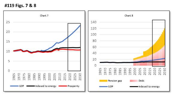
The final pair of charts converts these numbers into their per-capita equivalents. The takeaway from figs. 7 and 8 is that, if we go on deluding ourselves about economic output, we’re going to travel ever further into a world in which smoke and mirrors can no longer disguise the difference between GDP and prosperity, and cannot reconcile the triangle of consumption, output and the destruction of the balance sheet.

Interesting essay, thanks! Have you read Tim Garrett’s work? It might provide some other insights. Garrett argues that energy consumption is not proportional to GDP, but rather is proportional to wealth: the integral of GDP. A different way to express the divergence between GDP and energy you discuss above might be that the debt we are relying on for growth is in fact mostly inflation that has not yet expressed itself, since monetary inflation eventually occurs with debt that is both unrepayable and not permitted to default.
http://www.inscc.utah.edu/~tgarrett/Economics/Economics.html
Thank you – I’ve started reading the link, the wealth/energy ratio looks interesting, and I’ll see what he has to say about energy costs.
I like the point about debt. Whenever debt cannot be repaid, there is a choice between “hard” default (“can’t pay, won’t pay”) and “soft” default, where inflation means that debt is repaid but in devalued money. Historically, the latter is much more common than the former.
Devalued Money
I may have said this here before. If so, I apologize for repeating myself.
The hedonic adjustments which are now applied to estimate GDP are heavily dependent on ‘bits and bytes’. When a cellular phone company allows more bits and bytes for the same consumer price, then the government imputes a reduction in the price…although the currency price did not change. Since the price went ‘down’, but currency revenue did not change, there must have been an increase in production. Now it is a fact that the cost of transmitting bits and bytes has been continually falling at an exponential rate since at least WWI.
But economic value does not consist primarily of more bits and bytes. It consists of creating something which people want, which was previously scarce. For example, a house or an office building or some potatoes where none existed previously. Many of the bits and bytes creations cannot actually be sold. They are for amusement, which people are not willing to pay very much for. They do, however, provide the eyeballs and sometimes engagement that advertisers search for. In short, the bits and bytes ‘innovations’ which are used to increase stated levels of GDP are problematical.
All this would simply make the graphs look worse. The pensioner who is paid in money devalued by the ‘imputed hedonics’ will be able to afford an awful lot of bits and bytes, but not much in the way of food or housing.
Don Stewart
Good points. My book has a chapter on these very issues. For anyone not familiar with it, there are three main distortions with official inflation measurement – “hedonics”, “geometric weighting” and “substitution”.
Between them, they lead to big understatement of inflation. It’s reasonable to assume that this also affects the GDP deflator used to calculate growth.
Additionally, “imputed”, non-cash sums are a big component of GDP (about 16% in the US, for example). An example of an imputation is where rent is ascribed by the statisticians to people who own their homes, so don’t actually pay any rent – the “imputation” is the sum they would have paid (to themselves?) if they hadn’t owned the property. This isn’t real money, as it can’t be spent, or taxed for that matter.
All in all, it’s a fair bet that GDP is smaller than we’re told, and growth is less. Government spends a bigger % of GDP than the reported number, because GDP is flattered by imputations. Effective debt/GDP ratios are understated for the same reason.
When I was at TP, I created a UK Essentials Index, which got quite a lot of press coverage. I maintain this, and have started building a US version. The cost of essentials keeps outstripping both CPI and wages. The essentials are what we buy first – “prosperity” is what’s left after essentials, the income we exercise “discretion” over. That’s why income and prosperity are different concepts.
Imputed rent can very well be taxed…
The virtual rent I would have payed hat I not owned my home is added to my income and taxed fully, here in Switzerland.
.I pay several 1000’s CHF each year, for the privilege of not paying rent. And Switzerland is not the only country to do so.
Correct me if I’m wrong, but is that some kind of wealth tax?
In some European countries, a tax (usually at a very low percentage) is levied on assets above a specified level.
But another way to do this would be not to tax the capital value, but estimate the income that the capital could in theory generate, and tax that.
If that were the case, either (A) the income would be calculated on capital (including property) above a certain threshold; or (B) the income would be calculated on all of the capital, but that theoretical income would be tax-free up to a certain level.
Examples:
A. Capital 2,000,000. Exempt: 1,000,000. Taxable: 1,000,000. Income assumed: 10%. Taxable imputed income: 100,000. Tax rate: 25%. Tax: 25,000.
B. Capital 2,000,000. No capital exempt. Income at 10%: 200,000. Tax-free imputed income allowance: 100,000. Taxable income: 100,000. Tax at 25%: 25,000.
Does it work a bit like that?
Not quite like that : when you buy a house the value is estimated, and the imputed rental value ( “Eigenmietwert EMW”) is established by the tax people.
These are updated once in a while, say in 10 year intervals.
The housevalue is added to to your wealth and taxed as a straight wealth tax ( between 0.1% and 0.25%, depending on your wealth).
The EMW is added to your other, normal, income, so increasing both tax rate and tax due. Real tax on a virtual income, year after year !
It is not unknown for swiss pensioners to move north, to Germany, as that decreases their tax considerable. ( Germany knows no imputed rental value and no wealth tax)
Jos
Tim – very interesting (and alarming) charts. Regarding pensions (as far as the Uk is concerned) the Government’s Workplace pensions scheme looks almost laughable with any money being put aside either being massively eroded by continuing inflation (which – as you mentioned – the Government needs to help inflate away its debt) or wiped out completely if there’s the crash you fear.
Perhaps in the future top One percent’s wealth will be measured by their ability to keep warm during the winter while everyone else freezes.
Incidentally there’s a very interesting independent comment by Kurt Cobb about Russian LNG being delivered to Boston and the over optimism linked to US shale gas production.
Thanks.
I think some, at least, of the top one percent realise that the current distribution of wealth is unsustainable. If the “populists” don’t tackle this, voters will elect the Left to do it. It would be much better if reform happened voluntarily (perhaps through wealth, capita gains or inheritance taxes).
Just a reminder, Tim, that pensions are a PAYG event. Federal governments do not provision for them. Otherwise we would be paying off pensions already spent. and we are not doing that. Nor will we ever do so. Underprovisioning is a political decision but it applies to non federal government pensions. The fed will be forced to step in to make pensions whole again as the private sector cannot afford to do it any longer. Otherwise there will be civil unrest.
John:
Public sector pensions are paid from contributions of current employees, so are not funded (there are, though, some states which do put contributions into funds – I think Quebec might be one of them). If contributions from today’s workers are less than pension payouts, the difference is made up from general taxation. That’s now the case in Britain, and the gap has an NPV often quoted at £1.5 trillion. in the US, the equivalent number is reported in the FRUSG.
State old age pensions are paid out of current taxation, so funding issues do not apply. But this is relevant, in situations where people need a private (funded) top-up to an insufficient state pension.
Where funding issues apply are privately saved pensions, employer-managed schemes and some (funded) public sector schemes. In the US, many funds have sought court permission to slash payments, warning that they’ll run out of funds unless they’re allowed to do this. I’ve seen examples of cuts of as much as 65% to monthly payments.
These don’t seem to be generally recognised issues yet – but they will become so. The WEF report about the “global pension timebomb” is well worth reading.
All true enough, Tim, as far as it goes. The time bomb is a certainty for private pensions. After all the tax base declines as the population ages while the pensions rise as numbers go up. The answer is the FEDERAL GOVERNMENT. It is monetary sovereign and at no burden on any “tax payers” can meet any pension as a PAYG event. There will be no excess inflation. The spending will grow the economy and pay for itself. This can only fall over when society runs out of resources to purchase. Cross our fingers that time is not yet upon us!
John
Tim
I have followed your work ever since the “perfect storm” report and found your work insightful and prescient. Thanks for your efforts.
I have a question on the post: In Fig2, why does the borrowing and pension impairment data start around 1999/2000? Should you not show this data from the start (1965) to be consistent?
Ideally, yes. Unfortunately, it’s hard to find really good debt figures before then, in the PPP international dollar convention required. It’s something I’m still working on.
The pension shortfall numbers, as I always make clear, are estimates. The WEF published a report with lots of useful data, including end-2015 and forecast 2050 numbers, rates of change and returns on investment for eight major economies, including the US, China, Japan and India. That’s made it relatively straightforward to arrive at global numbers. So I can carry those back further. But both need to be shown together, and pre-1999 debt is something that I’m still working on.
So the next print festivities are in the making. Lehman 8.0
Civil unrest through wages that cannot support a living, or tens of thousands of pensioners holding up their hands on the stairs to the subway. Or higher rates that collapses the economies. Or force pension funds fully into stocks, blowing the bubble higher.
As the saying goes; watch what they do, not what they say. When they pull the table cloth from under our fancy dinner, i wonder what’s left on the table.
Pension shortfalls have ballooned because returns on savings have collapsed. In the US, for example, bonds’ historic real return was 3.6% but, going forward, the WEF report shows just 0.15%. For equities, the historic 8.3% has slumped to 3.45%. Using these assumptions crushes future returns. I’ve calculated that, for every $1 saved before, you’d need to save $2.70 have the same pot at the same future retirement date. Is saving (say) 10% of income was sufficient before, you’d need to save about 27% now, which isn’t feasible.
Of course, interest rates send economic signals. High rates say “save, don’t borrow”, and low rates say the opposite. So current monetary policy is telling people not to save. The logic behind that is that people are being instructed (by signals) not to save. Put another way, policy has created a deterrent to saving. In other words, we’re being told not to save because the economy can NOT afford savings.
That’s how bad the fundamentals are.
Tim thanks for reply – here’s the link the to article I mentioned.
http://resourceinsights.blogspot.co.uk/2018/02/lng-comes-to-boston-harbinger-of-future.html
Also
Thanks – I’ve been reading the site with interest, particularly the article about Cape Town.
Regarding pensions and the massive pension gap I can see no other alternative than old people having to be looked after by their children or relatives. As energy is going to get very scarce in the decades to come I can’t see where the money to look after the elderly is going to come from.
I’m quite sure you’re right.
Tim – I know you read CapX so you may have already gone though the article by Tom Brammar about a possible problem with a welfare system that’s effectively subsidised by the value of your home.
I was reading about the elderly person who had a stroke whilst in a care home and then had to pay for her own post stroke intensive care of £1000 a day by selling her house – the proceeds of which also have to pay for her normal care home fees after recovery.
I was initially surprised by this as when my step mother had a stroke in 2013 she was put in a special recovery hospital for about three months until she was well enough to move back to her own home. Now here’s the first point – I’m wondering that then had she already been in a care home would she then have been liable to pay for the required intensive care herself as her home was no longer her residence.
It seems very unfair if so and the council would have to step in earlier to pay her normal care home fees if her assets had been quickly eroded by intensive care.
Second point is that Tom has hit on a very important point and it is more than possible that house prices could fall or at the very least stagnate meaning that the amount of money the Government will have to stump up for care homes when the elderly have next to no assets left would probably reach an impossibly high amount.
So this appears to be confirmation of my previous comment that children or relatives may have to look after elderly people. Something’s going to give here.
I’ve not read that, though I’ve written quite a lot of articles for CapX.
One big reason why Mrs May lost her majority was her plan to make people use the equity in their homes to fund their own care in old age. I met quite a few people who were indignant about that, as though the high value of their homes was their own virtuous achievement, rather than mainly luck (when they bought) and more luck (policies of ultra-cheap money).
As I’ve said before, house prices cannot be monetised – if every owner (or even a big number of them) tried to convert inflated property values into cash, prices would slump. That’s the case because the only buyers for the housing stock are the same people who already own it.
I don’t see how the maths of government services can work, when we combine low wages (hence low tax), an ageing population, and low rates of tax on inheritance, capital gains and corporate earnings. Labour’s solution is likely to be increasing each of those tax rates, the Conservatives’ to try to reduce public spending. It’s pretty clear which will be favoured by a majority of voters.
Tim, You need to see this to understand what goes on with money today;
Yes you’re right Tim – on our current trajectory I would expect (like you) a Labour win in 2022 (if the Conservatives last that long). I wonder if the 2020 will be when May gets 2020 vision and the penny drops
Thank you for yet another interesting post.
“It should be added that the inflated values of assets (such as stocks, bonds and property) do not offset these trends – these values cannot be monetised by their owners selling assets to each other. Any significant attempt to monetise them – and a panic rush to do exactly that can’t be ruled out – would cause values to collapse.”
Going forward, do you expect a fire sale (collapsing asset value) or very high inflation (lower purchasing power)? The finance press is reporting inflation is back and rates increase. Any though on why inflation is back, e.g. CB cutting back QE/maturing bonds that are not repurchased, higher oil price, “healthy economy” increase utilization, other factors?
It seems to me CB will have to increase their rates faster than advertised in the next year or two. If not, confidence that is left will start to wane. This is happening at the same time as oil prices follow an upward trajectory. Consumers will thus face higher energy cost and debt servicing. Not pretty.
Jeff
Ever since 2008 we’ve been living with Mickey Mouse economics, often defying logic.
The real problem with excessive debt isn’t repaying it, but keeping up interest payments. World debt had become so high by 2008 that the only way to prevent disaster was making debt ultra-cheap to service. Central banks slashed policy rates, but also used QE to push up the price of bonds, thereby lowering yields.
It’s becoming recognised that this has been extremely harmful, and we can’t live in a financial ‘state of emergency’ forever. Hence the talk about raising rates. But this isn’t going to be a return to normality. We’re not going to see rates of, say, 5%, because that would make debt impossible to service. But, since we can’t get back to normality (rates of, say, inflation +2%) the damage will go on. Any meaningful rise in rates would crash equities, bonds and property.
So, if there won’t be an intentional restoration of normal rates, inflation becomes key. That, logically, is where commodity prices play a big role. But inflation is less likely to happen when the economy is subdued.
Taking all in all, I expect inflation to rise, pushed up by energy and other commodities, when supply constraints collide with demand in countries like China. That’s when rates rise and asset prices slump. But there’s no way of knowing when this will happen.
I hope that helps.
Tim just quoting form your reply ‘But inflation is less likely to happen when the economy is subdued’ This means that there can be no rises in public spending without extra taxation as real growth will not be there. We could get a point where people realise that certain things won’t get done unless they volunteer to do things for free.
Hi Donald,
Another way of saying that is that wages are going to go to zero (or very low). Your remark, which I think is correct, emphasizes only one side – the voluntary cooperation side. The other side to radically low wages is the coercive side: as governments and businesses can less and less afford living wages for services, they will move back to the older forms of “payment” or “taxation” – namely indentured servitude and forced labor / slavery. Bare sustenance in return for forced labor is a form of “taxation” of very long duration. Building of the pyramids, e.g. Prison populations can be hired out to companies for extremely low wages or used by the State for State projects (e.g., Soviet Russia). Able-bodied citizens can be forced to work in return for food stamps, Medicaid (as is already being proposed), etc. I think we can expect similar arrangements – room and board with a very low level of wages – to make a big comeback with businesses as well. See this, e.g.: https://www.nakedcapitalism.com/2018/02/law-professor-proposes-bringing-back-indentured-servitude.html
Hi Jeff – well here we have the gig economy which is moving in the direction you’ve described.
Hi Tim
Thanks for another thought provoking post.
What intrigues me is when are the great unwashed going to realize that the World they see on the MSM is basically unsustainable? On the Web there is of course a great deal of unorthodox opinion but this doesn’t penetrate into Daily Mail land. Most people still probably believe that interest rates will never go up; that house prices will never fall and that they will get a huge pension that will enable them to travel and live the life of Riley. What on earth are these people to think if the truth becomes known?
The only way out of this is via inflation as I see it, the stealth default of choice which preserves the money illusion and keeps the plates spinning until something as basic as energy economics asserts the truth that cannot be denied.
You are right on all counts – and this is what the next article will be about.
Hi I do put links to this site on the Guardian. I sometimes get positive responses but also negatives ones ‘Oh it’s a WorldPress blog – so it must be official’
I actually did get a couple of positive responses on the Daily Mail but sadly far more down arrows than up.
I agree that people won’t face reality even when they’re confronted with facts. Perhaps their attitude can be summed up by the lyrics to a well known Prince song ‘So tonight I’m gonna party like it’s 1999!’
I might be changing the site address soon, though it will still be hosted by WordPress.
One of the things that comes up in the next article is how much of what we’re discussing here is already reality – depressed real wages, rising cost of essentials, deterioration in value added by activities, debt too high for realistic interest rates to be viable.